Tim Brown organized

Remember this moment

Wed, 22 Jun 2016

Every day, I wake up and can’t wait to start work. It’s been that way for at least ten years. This is such an exciting moment. For sharing ideas, making tools, and actually practicing typography. We are designing in the fourth dimension, and we are disoriented.

Later, when we look back, I want to remember that I tried hard to understand this moment's historical significance, and its potential to influence the future, as I decided how to spend my time. I want to remember that I was careful. That I paid attention. That I enjoyed trying to orient myself.

And I want to remember that it was incredibly frustrating. My brain and hands want to design with tools that don’t exist yet. Only time and effort will make those tools real, and waiting – having to spend my life convincing others about the significance of this moment, and having to refocus my energy repeatedly as we crawl toward answers – is agonizing.

Making time to read

Fri, 27 May 2016

My work at Typekit has been intense lately because we’re making big changes, and that means lots more communication to coordinate everybody (plus, you know, doing the work we communicate about). I have more active side projects than ever, and they're going well. My schedule works for me. I have plenty of time with family and friends.

But I don’t read or study the work of others as much as I used to. I don't pay attention to other people the way I used to, and I don't like this at all. Reading blog posts and articles is how I got where I am, professionally. It's why I have the ideas I have, and it's the basis of my relationships with good people (“Hey, I liked what you wrote...”). Playing with a technique or an idea somebody shared has always helped me think.

Reading time can be hard to justify, even to oneself. There is no deadline. It's not going to move any immediate projects forward (most likely). And it often feels like a waste of time, especially if your interests are diverse. But it's important. Most great work is the product of collaborative thinking.

Jeffrey said that if you don't write, you don't know what you think. Well, if you don't read, you don't know what you could think.

Pressure calendar

Mon, 9 May 2016

Sometimes I make a pressure calendar — a quick, disposable calendar that helps me think clearly when I feel overwhelmed. Here’s one I made the other day.

I use pressure calendars when my to-do list is full of tasks that seem equally important, or tasks that could each consume all of my available time (like when I have speaking engagements or deadlines approaching). A pressure calendar shows me how much time I have, and helps me spend that time wisely.

It’s a printout from my calendar app, so for starters I can see scheduled commitments. If I have family visiting for a few days, for example, I know I won’t be working in the morning on those days. If I have travel plans, I know I’ll spend the night before packing. And so on.

I draw horizontal lines on the printout to divide days into thirds. Into the available chunks, I pencil in tasks. This helps me judge available time realistically, because I know I can expect four hours of productive time in each third of a calendar day. What can I get done in four hours?

In practice, things never go exactly according to my penciled-in plan. Stuff happens, so I cross off the days that have passed, erase as needed, and sketch out new plans. Although this kind of editing can get messy, it helps to be able to wrap my head around my tasks in a time-related way without having to use software. Hassles and overhead that wouldn’t normally bother me can really stress me out when I’m under pressure.

I refer to the pressure calendar constantly until I no longer feel overwhelmed — and then it’s amazing. Amazing to see how much I accomplished in a short span of time. Amazing to reflect on the stress I felt. And amazing to take all that stress, crumple it up, and toss it in the trash.

Hello world

Wed, 4 May 2016

Now I have a personal blog. Thanks for reading. Look, it even has an RSS feed. I don't know what will go here yet. Probably the sort of things I put in personal stuff and recently.

I have wanted to start this for a while. Feels good. Making websites is harder than it used to be, but better, and I still love doing it. Nothing like having your own place, and making it yours.

On Web Typography

Wed, 6 Aug 2014

Jason Santa Maria wrote a book on web typography.

To say that Jason’s ideas and designs have influenced me is an understatement. I have followed his blog since version three. Years later, we started talking and he encouraged me to write for A List Apart. Soon after, we started working together on Typekit. I can show you many instances of my work that improved dramatically because of his feedback or example.

That same influence pervades this book. It’s not only an education in solid typographic fundamentals, written by a designer who deeply understands the web and has profound respect for design history — it’s a sneak peek at the way Jason practices design, full of advice so great and so plain that you simultaneously smile and smack your forehead because now you get it.

Read an excerpt, and buy the book.

On headlines:

Many folks, myself included, tend to use sans serifs for headlines. It comes down to simple geometry: most sans serifs can be packed in tighter than serifs because the letters take up less space. This allows for more characters per line and a larger type size.

On margins:

Without a healthy margin around our text, our words will feel congested like a highway on-ramp at rush hour. In general, I like to allot at least around 1.5–2 ems of margin around body text.

On word association as a method for choosing typefaces:

Rather than scrolling endlessly through pages of typefaces and getting tangled up thinking, “Is this the right one?”, come at it from a different angle. Ask yourself: what do I want my design to convey? Think of words that describe the feelings or moods you’d like to impart.

On typographic systems:

Like any good system, typography provides a method to accomplish a task. A typographic system establishes hierarchy, meaning it helps us prioritize content based on individual elements and relationships between them. It also helps our readers easily scan chunks of information and understand what they’re looking at. When done right, a typographic system feels intuitive, like an unspoken set of instructions.

On balance in typography:

Typography is a pursuit that combines the best of history, writing, math, artistry, and craft. No one thing rules over another. Sometimes the math won’t add up, but the type may look right. When that happens, you need to rely on your instincts.

Originally published on Medium.

Molten leading (or, fluid line-height)

Fri, 3 Feb 2012

This is not a demo. I’m only explaining a need as I see it. I don’t have the JS chops to make it real. Maybe you do?

Updates

Original post

When a responsive composition meets a viewport, there are different ways to fill space. What interests me most here is a fundamental triadic relationship in typesetting — that of a text’s font size, line height, and line length. Adjusting any one of these elements without also adjusting the others is a recipe for uncomfortable reading, which is one reason designers have such a difficult time with fluid web layout.

One way to fill space is to scale text while keeping its proportions intact. This preserves the size/leading/measure relationship, and can work really well for some experiences (see Mark Hurrell’s post on orientation and fluid grids). But an increase in font size can be jarring to readers; A larger font size affects reading distance comfort. If I were to rotate my iPad while reading, and the text scaled up, I can imagine needing to hold the device a few inches farther away as a result. This is not what designers want to have happen to text intended for reading.

In retrospect, this was a bad example. Some designers and readers may not want this to happen, but others epxect rotating a device to scale the type.

Another way to fill space is to use fluid widths. The problem in this case is that CSS line-height is tied to font-size, which is rooted in browser font sizing and environmental resolution, while line length is based on width, which is rooted in viewport dimensions. So a carefully balanced relationship among font size, line height, and line length easily breaks down. We end up with line lengths that feel too long, font sizes that seem too small, line spacing that feels too tight or loose.

What we need is a fluid way to set line height. Web designers should be able to define line height as a range, like we do with min- and max-width. I made a simple page to visualize how I’m thinking about this. Molten leading would maintain a specific font-size while adjusting line-height based on width. In other words, I would essentially like to tween a paragraph from this:

width: 15em;
line-height: 1.3;

To this:

width: 36em;
line-height: 1.4;

So that it would be possible to find line height dynamically at any given point in between:

width: 30em;
line-height: 1.371428571;

To find that line-height value, I used this formula: ((current width − min-width)/(max-width − min-width)) × (line-height − min-line-height) + min-line-height = line-height. With actual values, that’s: ((30em−15em)/(36em−15em)) × (1.4−1.3) + 1.3 = 1.371428571.

What I’m not sure about is how to get the min/max widths of an element that are needed for this formula. If CSS authors routinely defined elements’ min-width, max-width, line-height, and some kind of min-line-height, that’d of course be ideal for this:

p {
  max-width: 36rem;
  min-width: 15rem;
  line-height: 1.4;
  -js-min-line-height: 1.3;
  }

But that’s not always practical. Often, the width limits of a given text block will be determined by percentage-based inheritance (66% of the parent element, which is 85% of its parent element…). It’d take some box model math to identify those narrow/wide limits. A script would have to figure out, for a given element, how wide/narrow can this grow?

If it’s possible to glean that information from existing CSS rules, then the only thing designers would need to define explicitly is a minimum line height. That value could be passed as a function argument, or maybe found in the CSS by looking for that -js-min-line-height rule in my example above.

This feels like a step toward more natural typographic behavior on the web. I’m just not sure where to go from here.

Also, for what it’s worth, Andy Clarke talked about this in 2010. His solution was to use media queries:

Type tip: As the width of the measure (line width) becomes wider, leading (line-height) should be increased to aid readability.

How can we solve this, and adjust the amount of leading as the width of a browser window changes? With CSS3 Media Queries.

What I’m talking about is augmenting CSS with range rules (effectively, min/max line-height) that don’t yet exist, but should for the sake of fluidity.

The truth is, most of us discover where we are headed when we arrive. — Watterson

You have to trust that the dots will somehow connect in your future. — Jobs

To do great work, the right strategy is not to plan too much. — Graham

Stories forthcoming.

About

Hello, I’m Tim Brown. I’m a designer and toolmaker with 15 years of product leadership experience.

My special interest is typography, a fancy word that means using fonts. I’m Head of Typography at Adobe, where I work on design tools and help people stay sharp.

I live and work in New York State’s Hudson Valley with my wife and college sweetheart Eileen, our three daughters, and our dogs.

Please feel welcome to email and connect on social.

Featured

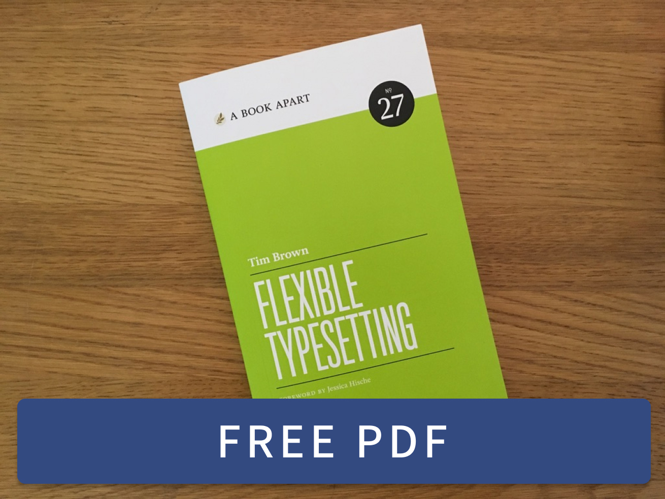
Flexible Typesetting Flexible Typesetting is a book about how to make websites and apps look great at different screen sizes.

Practicing Typography Basics Practicing Typography Basics is a short, free video series for both beginners and pros. Meditation for designers.

Blogroll

Feeds & social

RSS: tbrown.org/feed.xml

@timbrown@typesetting
LinkedInPolywork

Colophon

This website was designed by me (Tim Brown) in CodePen and Visual Studio Code. It’s typeset in Fern by David Jonathan Ross, with Mallory by Tobias Frere-Jones and Source Code Pro by Paul Hunt.

Generated by 11ty, managed on GitHub, hosted on Netlify, registered with Hover, and measured with Fathom.

My friend Chris Silverman illustrated the header graphic. Yes, it’s a BOTW reference!