Christopher Alexander, The Process of Creating Life:
You know the feeling which the thing will have. But you do not yet know the form. In fact, you keep having to change the form, because as the work unfolds, you find out many, many details which have the wrong feeling, which do not function, in response to the whole, as you thought they would. Because you keep the feeling constant, you have to change the form.
Wed, 21 May 2025
Daily cultural updates with AI
Sun, 2 Feb 2025
My pal Matt Colyer recently explained how to use ChatGPT’s 4o model to craft a sophisticated, information-dense prompt to then pass to the o1 model — which can in turn provide rich responses.
I’ve used this technique a few times already, to wonderful effect. One example is a daily cultural update.
Each morning, while I’m AeroPressing my coffee, ChatGPT reads aloud several pieces of news. So far: I learned about Islamic geometric art and reached out to Ahmad Angawi to thank him for his inspiring work; I heard about fashion trends, then studied how algorithmic changes have influenced aesthetics; And, I laughed with Eileen about a robot cat designed to blow on hot liquids.
Generally, subjects like art, music, literature, and architecture are fascinating and nourishing for me. But I have a hard time dipping into these topics, maybe because of the limited time I allocate. Editorial features are too elaborate, and social algorithms (especially the atrocious shorts format) are too fragmented. What I needed was an assistant to toss a few things my way each day, and be able to dig in if something sounded interesting. So for a week now, I’ve been using ChatGPT as just such an assistant. Let me explain how I set it up.
How I set up daily cultural updates
Initial setup: First, I asked 4o for guidance on improving my cultural awareness in a way that would not be overwhelming. It gave me the typical numbered-list feedback, encouraging me to diversify what I read, watch global trends, and broaden my exposure to art and music, suggesting and linking to a variety of sources online.
4o as prompt-writer: Next, I asked 4o to use this information to write an expert prompt for o1, so that o1 could craft a plan for cultural exercise and help me build good habits. As part of this prompt-building, I instructed 4o to use its web-searching ability to find supporting information (o1 can’t do that) and to make sure that the plan centered on a daily briefing. 4o then wrote me a prompt for o1 (essentially an essay full of links).
Over to o1, and back: Finally, I copy/pasted the 4o prompt to o1 and received in response a structured plan for daily cultural briefings. Copying the o1 plan back into a new 4o chat with scheduled tasks enabled (another thing o1 can’t do), I asked ChatGPT to act as my assistant, scheduling a daily cultural awareness update at 7:00AM.
🎭🎶📚
I appreciate Matt sharing this tip about using 4o to write better prompts for o1. I’ve also used it to create a dedicated chat for surprise-me style deep-dives into topics that interest me, and to set unique career goals that match my interests and aptitudes. It’s exciting to use AI as a tool in these ways.
Pableaux’s Cajun Cleanup
Mon, 27 Jan 2025
Today I learned that Pableaux Johnson has passed away, so in his memory I’m sharing with you a recipe he gave me — you’ll love it, even if you never cook this dish. May he rest in peace.
I met Pableaux in New Orleans in 2011, as Bryan Mason and I got ready for TypeCon. Pableaux, laughing, told me I looked like a cop and guided us to breakfast at a friend’s new restaurant. The food was delicious, but what I remember most is how Pableaux made me feel welcome, and the strength and generosity of his joie de vivre. As we left breakfast, Bryan gifted me a book written by the proprietor, which kindled in me a new appreciation for cooking. I kept in touch with Pableaux, who encouraged me by sharing guidance and recipes, including this article he wrote. Enjoy.
Cooking Up a Turkey Bone Gumbo
The aftermath of any authentic Thanksgiving feast involves a heapin’ helpin’ of leftovers. It’s just part of the package. How else would we sustain ourselves through the rest of the long weekend? The accepted Thanksgiving follow-up activities — long naps and mile-high evening sandwiches — are time-honored traditions that make this holiday one of America’s favorites.
For most people, the leftover tradition begins and ends with building “the Ultimate Turkey Sandwich” — a gargantuan structure slathered with layers of mayo, candied yams, cranberry salsa, and just about anything else that graced the banquet table hours earlier.
But if you limit your post-feast snacking to sandwiches, you’ll be missing one of the great American holiday dishes — the infamous Turkey Bone Gumbo.
After a full day of cooking the feast, Cajun cooks all over south Louisiana celebrate the day after Thanksgiving with a bubbling pot of dark gumbo, thick with chunks of leftover bird and spiked with spicy chunks of smoked sausage.
Since the recipe starts with the stripped turkey carcass, this edible ritual makes the most of the holiday bird. A long, slow simmer efficiently removes any bits of meat still clinging to the bones and results in a thick, rich base for the gumbo. It’s a simple (though somewhat time consuming) two-step process, but well worth the effort.
If you don’t have the time to cook up a batch on the day after Turkey Day, wrap up the carcass for freezer storage until you have a free day around the house. It’s the perfect low maintenance activity for a lazy early winter’s afternoon.
This twofold recipe comes from the cookbook “Louisiana Real & Rustic” (1996, William Morrow & Co.), a great collection of recipes from Emeril “The Bam Man” Lagasse (New Orleans’ new full-contact food phenomenon) and Marcelle Bienvinue (Cajun Lousiana’s foremost culinary storyteller).
Turkey Broth
1 turkey carcass
3 ribs celery, cut into 4-inch pieces
2 medium onions, quartered
4 quarts water, or enough to cover carcass
2 teaspoons salt
1 tablespoon black peppercorns
4 bay leaves
Place the carcass in a large stockpot. Add the celery, onions, water, salt, peppercorns, and bay leaves.
Bring to a boil, reduce the heat to medium, and simmer, uncovered, for three hours. Remove from the heat. Skim any fat that has risen to the surface.
Strain through a large fine-mesh sieve (or simple colander). Reserve any meat that has fallen off the bones and pick off any meat that may still remain on the carcass.
Reserve the onions and celery for gumbo. Use immediately or store the broth in quart containers in the freezer.
Makes about 2 quarts (or enough for 1 gumbo).
Turkey Bone Gumbo
3/4 cup vegetable oil
3/4 cup flour
2 cups chopped onions
1/2 cup chopped bell peppers
1/2 cup chopped celery
1 teaspoon salt
1/2 teaspoon cayenne
1/2 pound smoked sausage, such as
  andouille or kielbasa, chopped
2 quarts turkey broth
reserved onions and celery from broth
2 tablespoons chopped parsley
2 tablespoons chopped green onion
Combine the oil and flour in a large cast iron pot or enameled cast iron Dutch oven, over medium heat.
Stirring slowly and consistently for 20 to 25 minutes, make a dark brown roux, the color of chocolate.
Season the onions, bell peppers, and celery with the salt and cayenne. Add this to the roux and stir until soft, about 5 minutes. Add the sausage and cook, stirring often for 5 minutes. Add the broth and bring to a boil. Reduce the heat to medium-low and simmer, uncovered for 45 minutes. Add the reserved turkey meat and the reserved onions and celery and cook for 15 minutes. Add the parsley and green onions.
Serve in soup bowls with rice. (Filé powder can be added at the table according to personal taste.)
Serves 8.
🦃🦴🥘
If you try this recipe, let me know — so I can reply as Pableaux replied to me, the first time I made it. 😁
Updates
D&D with ChatGPT
Thu, 5 Dec 2024
Growing up, Dungeons & Dragons (D&D) had always intrigued me. A neighbor with whom I was friendly but not very close had all these mysterious books and beautiful dice, and he tried to explain things to me … but we didn’t have much time to get into it.
Then a few years ago, I picked up a starter set to try playing with my older girls. I acted as the Dungeon Master (DM) and read the story to them, explaining how to play while keeping one eye on the instructions. They liked imagining their characters and playing with the dice, but it wasn’t a very memorable experience.
Fast forward to yesterday. I suddenly wondered, can ChatGPT be the DM, provide the story, and take care of remembering all our stats, abilities, and inventory? Heck yeah it can!
Yes, I can absolutely be your Dungeon Master (DM) for a Dungeons & Dragons game! Since you’re new, I’ll guide you through everything step by step, keeping it fun and simple.
We used ChatGPT to create our own characters, track stats, and play out a unique story. My daughters completely loved making up their own characters easily — Frostfang, a cat wizard and Shadow, a wolf rogue. Plus, I could play along with them as Cool Blue, a human fighter named after the Gatorade I was drinking. It was great to experience a story we could guide, but didn’t need to totally invent. We are searching an enchanted forest for dragons to tame and ride. The forest is full of warrior cats because my 12yo insisted on this. And every so often there’s a platypus involved because my 7yo is partially playing.
At this point, what we’re doing probably does not count as Dungeons & Dragons, but we’re having a blast. We’re rolling physical dice to determine outcomes, exercising special abilities ChatGPT created for our characters, and moving through a rich choose–your-own-adventure story with challenging battle sequences. A great family activity for dark winter evenings. We’re definitely going to do more of this during holiday downtime.
Here’s an example response after we made a decision:
Investigating the Scale: Results
Your team carefully examines the glowing dragon scale from all angles, piecing together its mysteries.
Frostfang: Arcane Insights
• Roll (14 + 3 = 17): Success!
Frostfang’s eyes narrow as they trace the faint magical runes etched into the scale’s surface. They recognize these as dragonbinding glyphs, ancient magic used to create bonds between dragons and those deemed worthy.
The scale is clearly more than a trophy—it’s a key to establishing a connection with a dragon. Frostfang deduces that finding and taming a dragon will require this scale as proof of your worth.
Shadow: Perceptive Observations
• Roll (5 + 4 = 9): Partial success.
Shadow sniffs the scale and catches faint traces of sulfur and ozone—likely from the fiery dragon construct—but nothing else stands out. They growl softly in frustration, muttering, “It smells like… magic and burning rocks.”
Cool Blue: Physical Examination
• Roll (18 + 1 = 19): Success!
Cool Blue feels the scale’s surface, noting that it’s cool to the touch despite its faint glow. It’s lighter than expected but incredibly durable, hinting at its draconic origin. Turning it over, Cool Blue notices that the scale has a slot or groove on the underside, as if it’s meant to fit into something larger—perhaps a pedestal or artifact deeper in the forest.
What the Party Discovers
The glowing scale is a powerful artifact that serves two purposes:
1. Dragonbinding Key: Proof of your worth to bond with a dragon.
2. Part of a Larger Puzzle: The slot underneath suggests the scale is part of a more significant artifact or device that you may find deeper in the forest.
Next Steps
1. Follow the Map: Return to the map and choose the next path (Shadowed Hollow or Crystal Glade).
2. Discuss as a Group: Talk about what you’ve learned and how to proceed.
3. Rest and Prepare: Heal up or recover before moving forward.
What does your group do next?
Onward! 🐉
🎙️ Notes from Practicing Typography 003:
Kevin Kelly, The Inevitable:
All devices need to interact. If a thing does not interact, it will be considered broken. Over the past few years I’ve been collecting stories of what it is like to grow up in the digital age. As an example, one of my friends had a young daughter under five years old. Like many other families these days, they didn’t have a TV, just computing screens. On a visit to another family who happened to have a TV, his daughter gravitated to the large screen. She went up to the TV, hunted around below it, and then looked behind it. “Where’s the mouse?” she asked. There had to be a way to interact with it. Another acquaintance’s son had access to a computer starting at the age of two. Once, when she and her son were shopping in a grocery store, she paused to decipher the label on a product. “Just click on it,” her son suggested. Of course cereal boxes should be interactive! […] The dumbest objects we can imagine today can be vastly improved by outfitting them with sensors and making them interactive.
Thu, 5 Dec 2024
Typography Advisor GPT
Sun, 1 Dec 2024
Introducing Typography Advisor. As an experiment, I made this custom version of ChatGPT to help when I’m designing with text and working on layouts. Like regular ChatGPT, I find it most useful when getting started or when I feel stuck — it can inform decisions, suggest next steps, and aid in exploration.
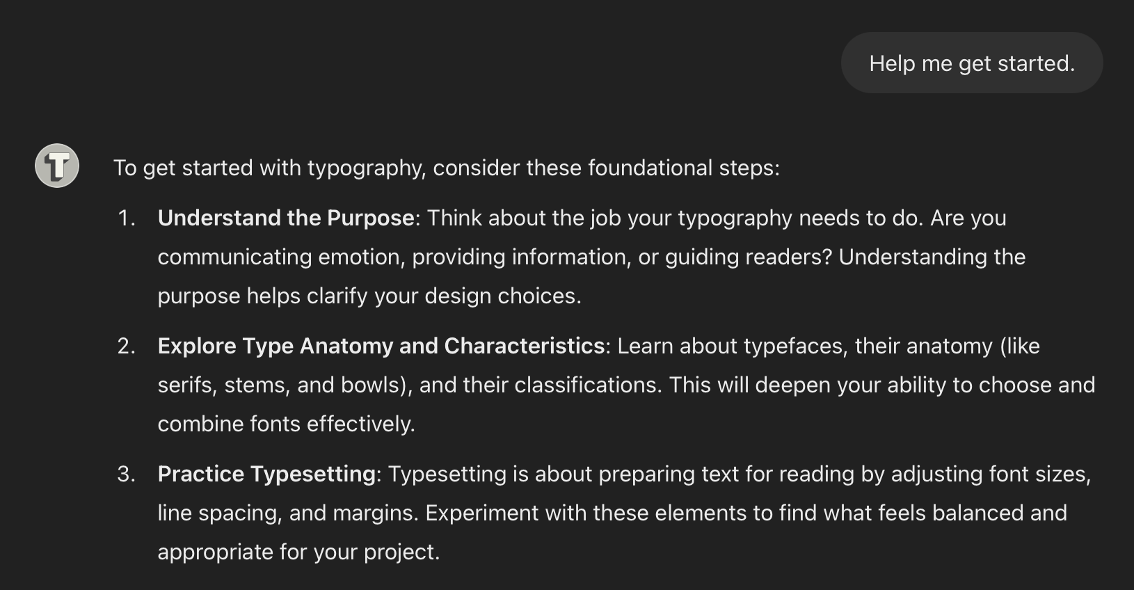
Intelligence technologies can accelerate our natural design habits. We already act as our own advisors by observing, referencing schema, and balancing unknowns in order to make predictions and discover new possibilities. With technology assistance, we can challenge ourselves to grow by considering advice that might not naturally come to mind. Like a second brain.
Typography Advisor is different than plain ChatGPT in a few ways that I hope make it more useful and tolerable: I have instructed it to be thoughtful, to limit jargon, and to link out to good resources often rather than trying to answer every question. Its strengths are in clarifying concepts, promoting learning, encouraging study, and providing context.
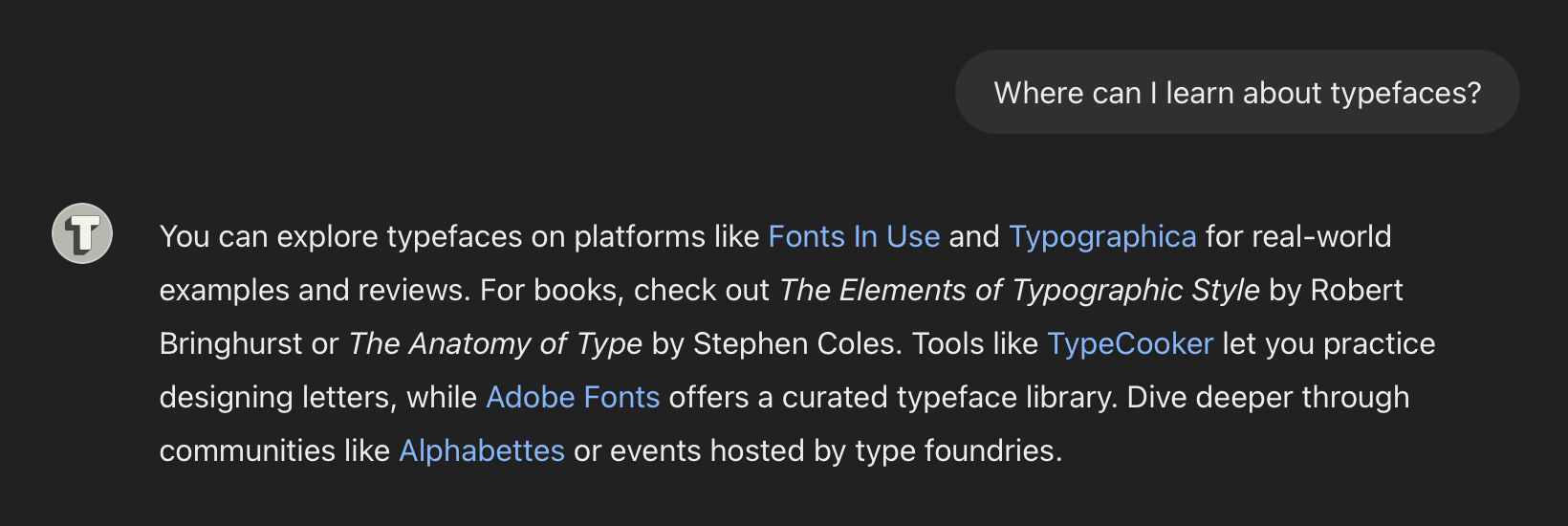
To make that happen, I preloaded this GPT (that’s what ChatGPT calls custom versions: Generative Pre-trained Transformers, or GPTs) with knowledge of my writings on typography. Annoyingly, Typography Advisor now biases towards my writings because of this preloaded knowledge. I’ve added many instructions to try to quiet this, but it’s an ongoing struggle. I also don’t trust its code generation or image analysis yet, so I’ve added warnings to responses that involve those kinds of content.
It’s not perfect, but I thought Typography Advisor was worth trying as an experiment. If you test it out, tell me via email or social. ChatGPT doesn’t share any details about how people are using this, so direct feedback is the only way to improve.
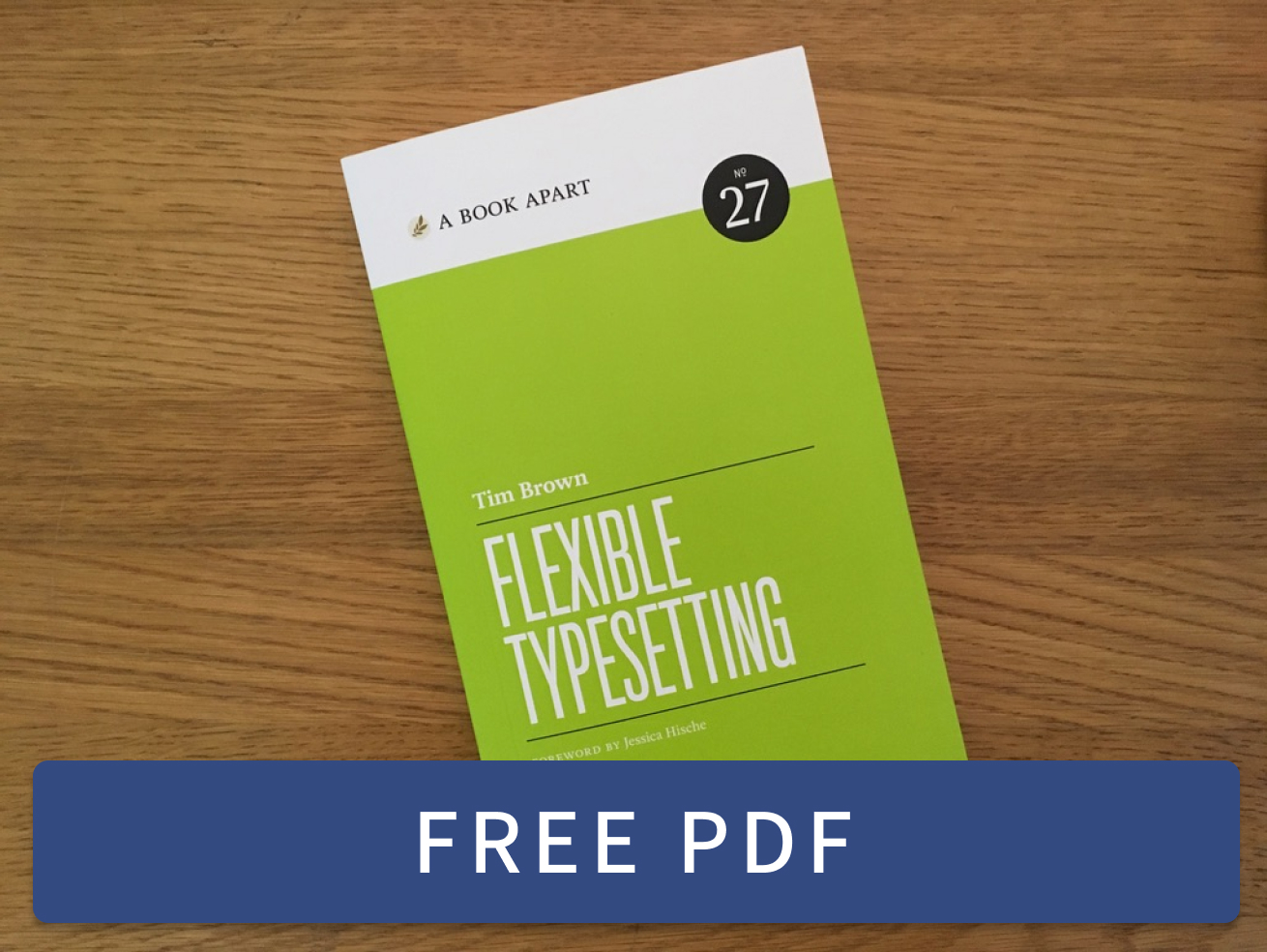 Flexible Typesetting
 Practicing Typography Basics