CSS forces
Wed, 4 May 2022
Flexibility causes pressure that makes layouts look bad. We can relieve that pressure in isolated ways thanks to CSS calculations, interpolation, and container awareness, but we lack a means of interconnection that would help maintain balance in compositions.
CSS forces are values that travel from a high-pressure area to other, low-pressure areas to help layouts reach a comfortable equilibrium.
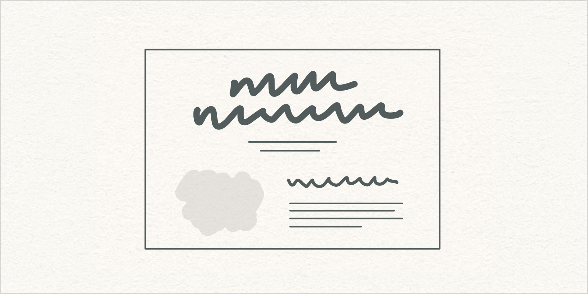
Let’s assume that this layout looks good.
Good-looking designs are hard to make. People have practiced design for centuries, and by practicing we develop our judgment about what looks good. Design may not always succeed, or feel appropriate, and we may not always agree about how good something looks, but practitioners share a general sense of overall quality or goodness.
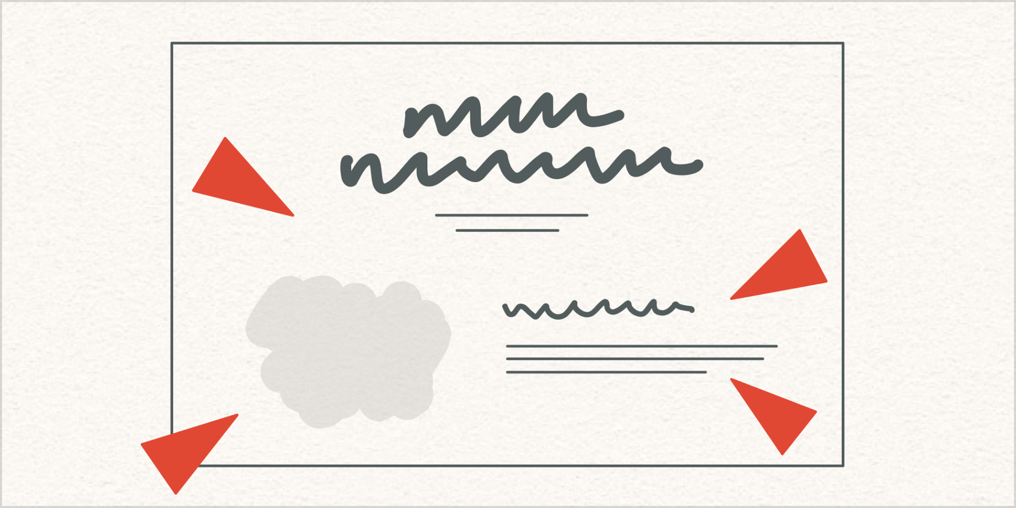
Next, let’s assume that this layout has changed in a way that does not look good. Maybe it feels like there’s too much empty space. Maybe short paragraphs are looking weird. Maybe heading sizes seem like they need adjustment. Whatever is going on, certain pressures are causing disruption.
Layouts change for many reasons. As designers of flexible compositions, we need to understand that there is inherent balance in good-looking typography, and that this balance is disrupted by pressure that results from layout changes.
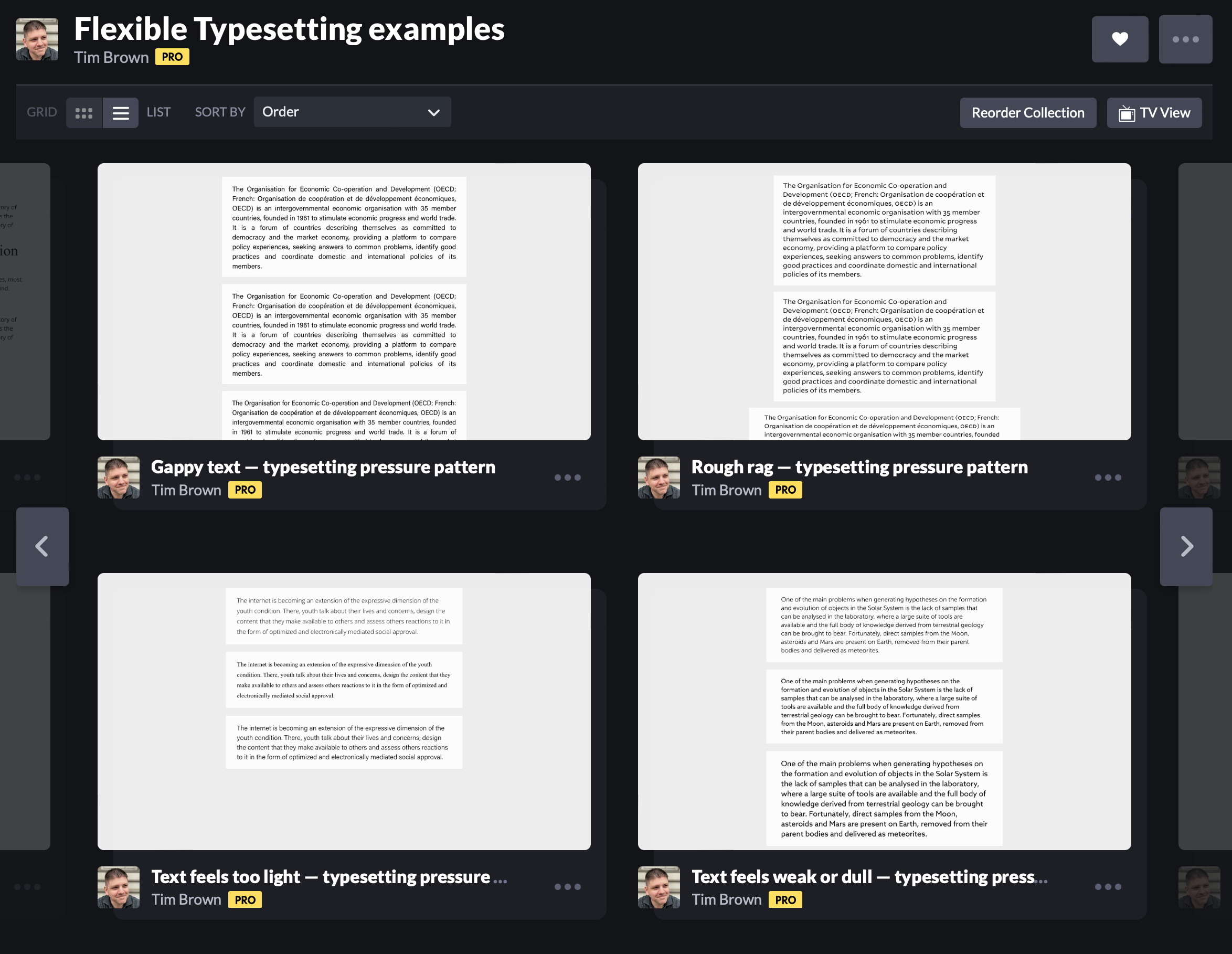
Pressure is easiest to grasp when we look at text blocks in isolation, as we did in Chapter 6 of Flexible Typesetting:
Relieving pressure gets easier with practice, because we develop schema about available options and we have experiences that inform our judgment about which options to apply in which circumstances. But relieving pressure in isolated text blocks isn’t enough to bring flexible layouts back into balance.
To achieve an active balance throughout a composition, we should borrow a concept from fluid dynamics: pressure-gradient forces.
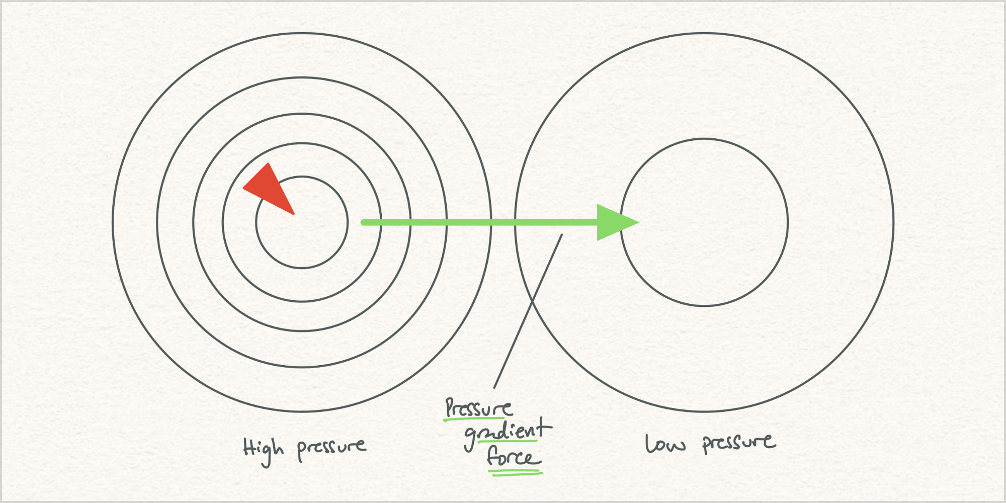
Wikipedia:
The pressure-gradient force is the force that results when there is a difference in pressure across a surface [and it] is always directed from the region of higher-pressure to the region of lower-pressure. When a fluid is in an equilibrium state (i.e. there are no net forces, and no acceleration), the system is referred to as being in hydrostatic equilibrium.
Sounds like a recipe for balanced, fluid layouts! (Never mind that in meteorology high-pressure areas feel more comfortable and low-pressure areas mean rain. My point here is that pressure gets distributed to balance a system.)
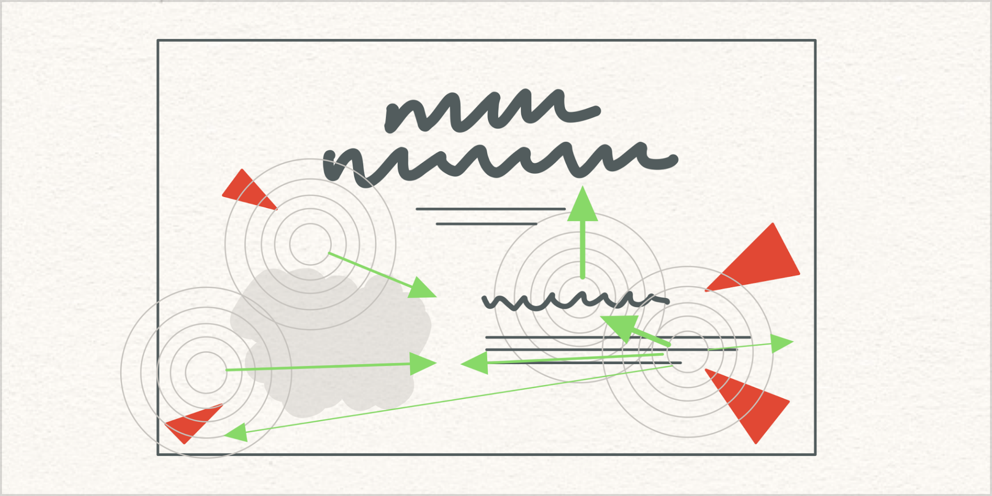
Observing and relieving pressure shouldn’t be an isolated exercise. Pressure creates opportunities for forces to distribute relief throughout a layout. Practically speaking, this means we need the ability to recognize pressures, apply forces, and prioritize forces.
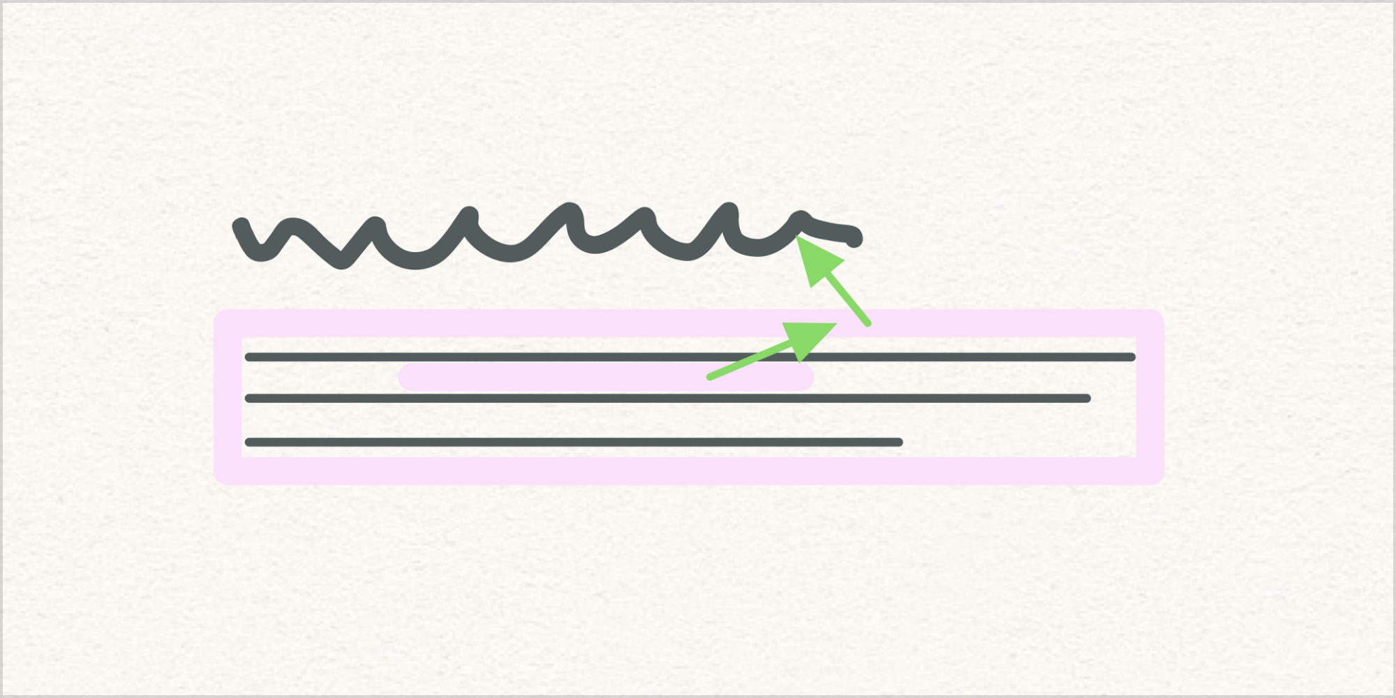
For example, a flexible line spacing value in one container could influence margins that surround the text block. That change in spaciousness may mean that nearby headings need size or spacing adjustments to stay feeling connected.
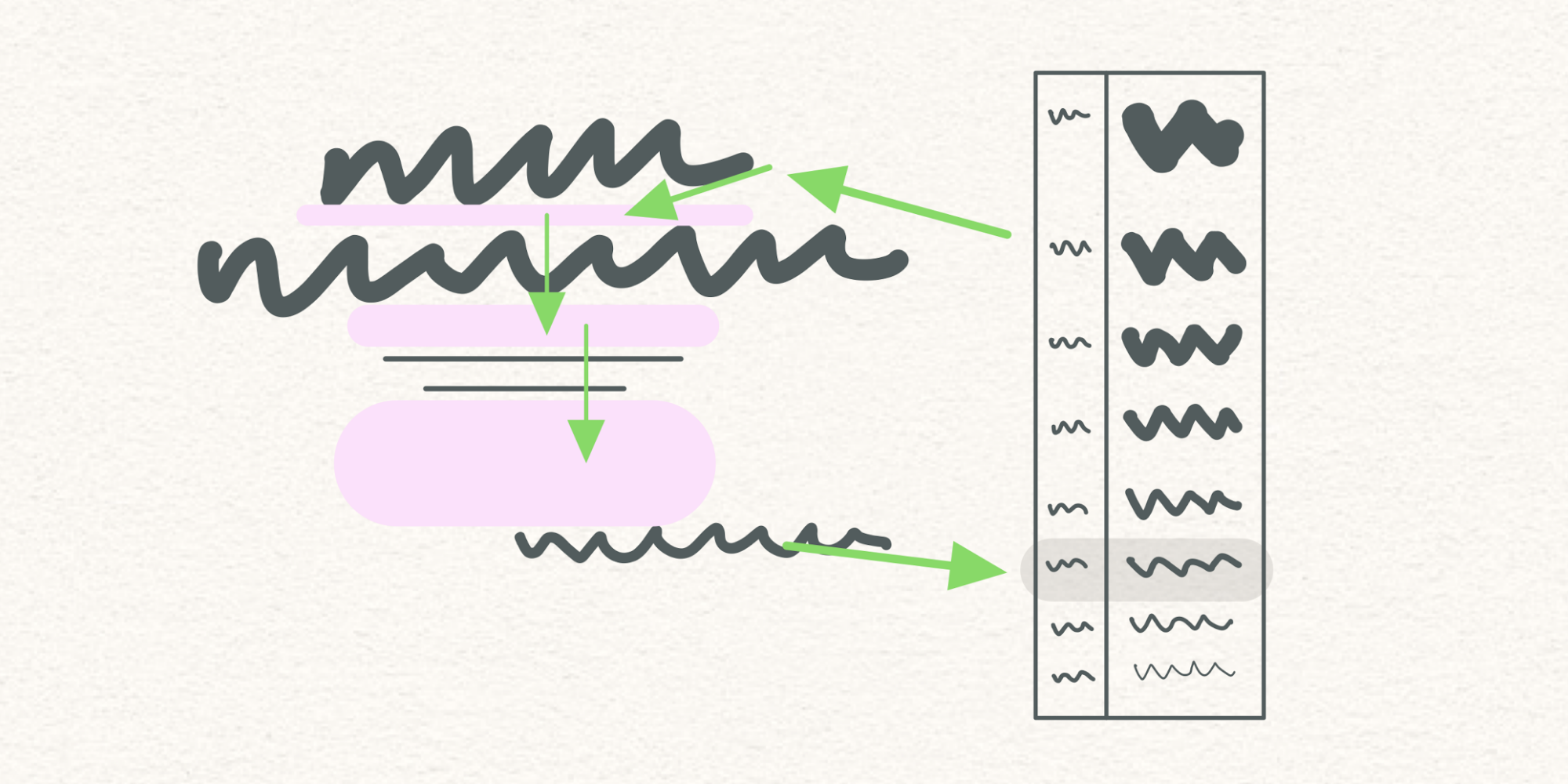
Or a scaling heading’s font size could influence a root variable that controls a measurement system, thereby affecting other parts of the composition in ways that should trickle into remote property relationships.
Always with you, it cannot be done. — Master Yoda
I don’t know how to make this idea real, but I sense the need for it to exist. Experiments with CSS variables in Vue, as well as my limited understanding of CSS module scripts, make me want to believe it is possible. I have wished for things before, and it has worked out well.
For flexible design to look as good as humans are capable of making things look, our container-oriented constraint systems need a key counterpart — a content-sensitive relationship system that balances flexible layout by prioritizing and directing forces according to pressure.
Helpful resources on racism & police reform from Jason Kottke
Sat, 13 Jun 2020
The reason that black people are in the streets has to do with the lives they’re forced to lead in this country. And they’re forced to lead these lives by the indifference and the apathy and a certain kind of ignorance — a very willful ignorance — on the part of their co-citizens.
That's James Baldwin, excerpted by Jason, who prefaces it by saying:
Hi. I wanted to take today to compile a sampling of what Black people (along with a few immigrant and other PoC voices) are saying. [...] I am trying to listen. Is America finally ready to listen? Are you ready?
In recent weeks, kottke.org has helped me focus on people, words, and images that both deserve and demand my attention and support. I am extremely grateful when Jason steers his resource-gathering and social analysis efforts & skills toward current events in the service of people who are disadvantaged and/or suffering.
For starters, listen. Please, today, set a timer for 10 minutes and try to absorb some of this:
Consider these as a set, and think about how this compounds hardship over generations:
And so much more:
Jason has also highlighted stunning art, rich literature, and arresting performances by Black creators. A goldmine of things to follow up on, support, and share further.
Using variable fonts should be easier and more fun
Fri, 27 Sep 2019
Recently I asked these questions on Twitter:
Are you designing with variable fonts? Do you feel like you understand them?
People’s answers vary quite a bit. I shared my own answers, too. Then, after my friend Erik made an analogy to understanding Unicode, I extended this analogy to emoji UI:
Using variable fonts today is like looking up smiley faces in Unicode code charts. You can do fine if you try. But compare that to using emoji in iOS. UI needs to help show that variable fonts are fun and easy — stacks of sliders are not.
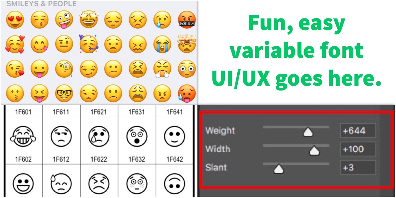
It’s high time for innovation in typographic experiences generally, but boring and technical variable font interfaces and workflows will continue to block all but a few people from enjoying and expressing the format’s capabilities.
National Teacher Appreciation Week 2019 deal for educators
Tue, 7 May 2019
This week, educators can get a free ebook version of Flexible Typesetting, plus an invitation to the private Slack group where readers and I share ideas about lesson plans. Send me an email describing your teaching work in two sentences, and I’ll send you a code to download the ebook at no charge.
Published in July, Flexible Typesetting is already required reading in elite design programs and has encouraged some to rethink core curriculum. Let's keep the trend going.
Thank you!
I offered this deal back in January too, and more than 100 teachers took me up on it. Learning from them has been excellent, and I'm sure I have a lot to learn from you, too.
My teachers
Finally, thanks to the teachers who continue to influence my life. From the acknowledgements of Flexible Typesetting:
Thanks to George Laws for opening my mind to the abstraction, balance, and systems in graphic design and type, for his mentoring, and for our breakfasts. Thanks to Arthur Hoener for introducing me to typography and giving me work opportunities that catalyzed my career. Thanks to Anne Galperin and Clif Meador for helping me think critically and find confidence. Thanks to Mr. Mahon for making me feel at home in art class. Thanks to the elementary school teachers who shaped and cared for me, including Mr. Weiss, Mr. Cafon, Ms. Oliver, Mr. Schmidt, and Ms. Hart.
January deal for educators
Fri, 4 Jan 2019
Teachers on my new book, Flexible Typesetting:
An outstanding text if you want to learn how to set harmonious text both on the web *and* print. 10/10
— Thomas Jockin
Students, designers, developers, and even the most seasoned typographers will gain insights into how to set type for the web and beyond.
— Amy Papaelias
Having read Tim Brown’s Flexible Typesetting ... I’m convinced I have to completely rethink my approach to intro type (at the very least).
— Maurice Meilleur
With a refreshing clarity found throughout Flexible Typesetting, Tim Brown explains what’s important in setting type for the web, but also why and how it’s important.
— Tobias Frere-Jones
Published in July, Flexible Typesetting is already required reading in elite design programs and has encouraged some to rethink core curriculum. Let's keep the trend going.
From now until the end of January, educators can get a free ebook version of Flexible Typesetting, plus an invitation to the private Slack group where readers and I share ideas about lesson plans. Send me an email describing your teaching work in two sentences, and I’ll send you a code to download the ebook at no charge.
Blogroll update
Fri, 4 Jan 2019
Adding a couple more sites to the blogroll:
Chen Hui Jing has a finger on the pulse of web design, consistently sharing interesting news and resources — with a recent focus on East Asian typography and layout. I follow HJ’s blog and Twitter feed. Looks like there’s also a bunch of good stuff on Notist.
Andy Bell is an independent web developer with a blog and all the right priorities. Andy's projects include My Browser, a tool for extracting a user's browser information (very helpful for customer support) and DevPal, a Q&A experience for web developers.
 Flexible Typesetting
 Practicing Typography Basics