Hello world
Wed, 4 May 2016
Now I have a personal blog. Thanks for reading. Look, it even has an RSS feed. I don't know what will go here yet. Probably the sort of things I put in personal stuff and recently.
I have wanted to start this for a while. Feels good. Making websites is harder than it used to be, but better, and I still love doing it. Nothing like having your own place, and making it yours.
On Web Typography
Wed, 6 Aug 2014
Jason Santa Maria wrote a book on web typography.
To say that Jason’s ideas and designs have influenced me is an understatement. I have followed his blog since version three. Years later, we started talking and he encouraged me to write for A List Apart. Soon after, we started working together on Typekit. I can show you many instances of my work that improved dramatically because of his feedback or example.
That same influence pervades this book. It’s not only an education in solid typographic fundamentals, written by a designer who deeply understands the web and has profound respect for design history — it’s a sneak peek at the way Jason practices design, full of advice so great and so plain that you simultaneously smile and smack your forehead because now you get it.
Read an excerpt, and buy the book.
On headlines:
Many folks, myself included, tend to use sans serifs for headlines. It comes down to simple geometry: most sans serifs can be packed in tighter than serifs because the letters take up less space. This allows for more characters per line and a larger type size.
On margins:
Without a healthy margin around our text, our words will feel congested like a highway on-ramp at rush hour. In general, I like to allot at least around 1.5–2 ems of margin around body text.
On word association as a method for choosing typefaces:
Rather than scrolling endlessly through pages of typefaces and getting tangled up thinking, “Is this the right one?”, come at it from a different angle. Ask yourself: what do I want my design to convey? Think of words that describe the feelings or moods you’d like to impart.
On typographic systems:
Like any good system, typography provides a method to accomplish a task. A typographic system establishes hierarchy, meaning it helps us prioritize content based on individual elements and relationships between them. It also helps our readers easily scan chunks of information and understand what they’re looking at. When done right, a typographic system feels intuitive, like an unspoken set of instructions.
On balance in typography:
Typography is a pursuit that combines the best of history, writing, math, artistry, and craft. No one thing rules over another. Sometimes the math won’t add up, but the type may look right. When that happens, you need to rely on your instincts.
Originally published on Medium.
Molten leading (or, fluid line-height)
Fri, 3 Feb 2012

This is not a demo. I’m only explaining a need as I see it. I don’t have the JS chops to make it real. Maybe you do?
Updates
Original post
When a responsive composition meets a viewport, there are different ways to fill space. What interests me most here is a fundamental triadic relationship in typesetting — that of a text’s font size, line height, and line length. Adjusting any one of these elements without also adjusting the others is a recipe for uncomfortable reading, which is one reason designers have such a difficult time with fluid web layout.

One way to fill space is to scale text while keeping its proportions intact. This preserves the size/leading/measure relationship, and can work really well for some experiences (see Mark Hurrell’s post on orientation and fluid grids). But an increase in font size can be jarring to readers; A larger font size affects reading distance comfort. If I were to rotate my iPad while reading, and the text scaled up, I can imagine needing to hold the device a few inches farther away as a result. This is not what designers want to have happen to text intended for reading.
In retrospect, this was a bad example. Some designers and readers may not want this to happen, but others epxect rotating a device to scale the type.

Another way to fill space is to use fluid widths. The problem in this case is that CSS line-height is tied to font-size, which is rooted in browser font sizing and environmental resolution, while line length is based on width, which is rooted in viewport dimensions. So a carefully balanced relationship among font size, line height, and line length easily breaks down. We end up with line lengths that feel too long, font sizes that seem too small, line spacing that feels too tight or loose.
What we need is a fluid way to set line height. Web designers should be able to define line height as a range, like we do with min- and max-width. I made a simple page to visualize how I’m thinking about this. Molten leading would maintain a specific font-size while adjusting line-height based on width. In other words, I would essentially like to tween a paragraph from this:
width: 15em;
line-height: 1.3;
To this:
width: 36em;
line-height: 1.4;
So that it would be possible to find line height dynamically at any given point in between:
width: 30em;
line-height: 1.371428571;
To find that line-height value, I used this formula: ((current width − min-width)/(max-width − min-width)) × (line-height − min-line-height) + min-line-height = line-height. With actual values, that’s: ((30em−15em)/(36em−15em)) × (1.4−1.3) + 1.3 = 1.371428571.
What I’m not sure about is how to get the min/max widths of an element that are needed for this formula. If CSS authors routinely defined elements’ min-width, max-width, line-height, and some kind of min-line-height, that’d of course be ideal for this:
p {
  max-width: 36rem;
  min-width: 15rem;
  line-height: 1.4;
  -js-min-line-height: 1.3;
  }
But that’s not always practical. Often, the width limits of a given text block will be determined by percentage-based inheritance (66% of the parent element, which is 85% of its parent element…). It’d take some box model math to identify those narrow/wide limits. A script would have to figure out, for a given element, how wide/narrow can this grow?
If it’s possible to glean that information from existing CSS rules, then the only thing designers would need to define explicitly is a minimum line height. That value could be passed as a function argument, or maybe found in the CSS by looking for that -js-min-line-height rule in my example above.
This feels like a step toward more natural typographic behavior on the web. I’m just not sure where to go from here.
Also, for what it’s worth, Andy Clarke talked about this in 2010. His solution was to use media queries:
Type tip: As the width of the measure (line width) becomes wider, leading (line-height) should be increased to aid readability.
How can we solve this, and adjust the amount of leading as the width of a browser window changes? With CSS3 Media Queries.
What I’m talking about is augmenting CSS with range rules (effectively, min/max line-height) that don’t yet exist, but should for the sake of fluidity.
Breakpoints and range rules
Fri, 27 Jan 2012

Think about the responsive nature of any particular web experience as a continuum of being. Along this continuum, on one axis, the experience can grow wide or narrow. Along a different axis, it can be near or far. Along a still different axis, it can be coarse or fine. There are many axes.
As a designed experience moves along a particular axis, it grows uncomfortable for any number of reasons: paragraphs feel too narrow or wide; font size feels too large or too small; elements touch or become awkwardly distant from one another. To cope with this discomfort, we use breakpoints. Breakpoints are moments of change. They allow us to make design adjustments that are only possible by changing the value or presence of CSS properties. We should invoke breakpoints as they are needed by our designs.
However, some design adjustments just happen in ordinary CSS. Properties like floats, positioning, minimum/maximum widths, and relative units of measurement (percentages, em, rem, unitless line-height) help us negotiate the collective moments between and among breakpoints. Think of these as range rules. Range rules are behavioral limits baked into CSS. For instance, if a column uses a min-width and/or max-width, these are rules that govern its range of motion. When elements in a layout float, but then bump against the limits of adjacent elements, this is a natural part of CSS — there is a range of acceptable behavior.
Range rules are not bounded by breakpoints. A fluid composition could use no breakpoints at all, and still the natural interplay of CSS behaviors could be evident. In a case like this, elements could stack, float, reflow, and resize, with all behavior governed by flexible CSS rules that permit a range of possible existence.
Range rules are also permeable. Breakpoints can trigger changes at any point along any axis of an experience continuum, and have the potential to both purposefully modify and accidentally disrupt the range rules they intersect. For instance, a breakpoint may cause a composition's font size to increase after a certain viewport width is reached, and this may occur before or after a paragraph within that composition has reached its max-width. And if that same paragraph's max-width is em-based, the rule that governs its range now has different absolute limits than it once did (it can grow wider now, because the unit on which it is based has become larger).
Responsive design is about rules, not truths. When we design responsively, maybe it would help to think of elements in a composition as having range rules that coexist and do not necessarily align, rather than treating the continuum of experience between breakpoints as something to be hopped over.
Does this make sense?
I wrote this post in a pretty authoritative tone, but I don't exactly mean it that way. I found it most comfortable to write as if I were, like, explaining the scientific properties of web design. I am still not sure that this makes sense. Please let me know what you think.
Thanks to Ray Schwartz and Chris Silverman for their feedback and general awesomeness. Thanks also to Mark Boulton, Nathan Ford, and Alex Morris, whose tweets today helped motivate me to articulate this all (those guys are incredible, they were already writing about zones/ranges last year!).
New: Notes blog
Tue, 21 Apr 2009
When I started writing Nice Web Type in college, I did not want to blog. Seven years, a backpack full of web typography resources, some moleskines full of thoughts, and time spent with a great bookmarking service can change one's mind.
It is impossible to know everything. I never wanted to blog because I feared I had neither an expert nor a unique voice to lend. So I read, and learned, a lot.
When I was privileged to use the bookmarking service Ma.gnolia, I began to share the things I was reading and the ways in which I interpreted those things. I did not want to stop! I contributed bookmarks to Ma.gnolia from 2006–2009. Then, in February of 2009, Ma.gnolia experienced severe data loss and ceased to exist.
But along the way I changed my mind about blogging.
I still dislike the term. Typing it makes my fingers feel lethargic, and I try at all costs to avoid saying it out loud. But blogging is just a different kind of sharing, and I thought of a way it can work for me. For now anyway, it can be like glue.
When I find a suitable replacement for Ma.gnolia, Nice Web Type's Notes blog can help you, my reader, stay abreast of migrated bookmarks. Notes will also allow me to bind bookmarks together by comparison, contextualization, or just added emphasis via a blog post (in addition to a bookmark in some service).
I'm still no expert, and I doubt that what I have to say hasn't already been said. But what I can do is take the nuggets I know about and show them to you. Maybe my own brand of learning-in-public can be for you what so many websites have been for me.
Want to see my notes?
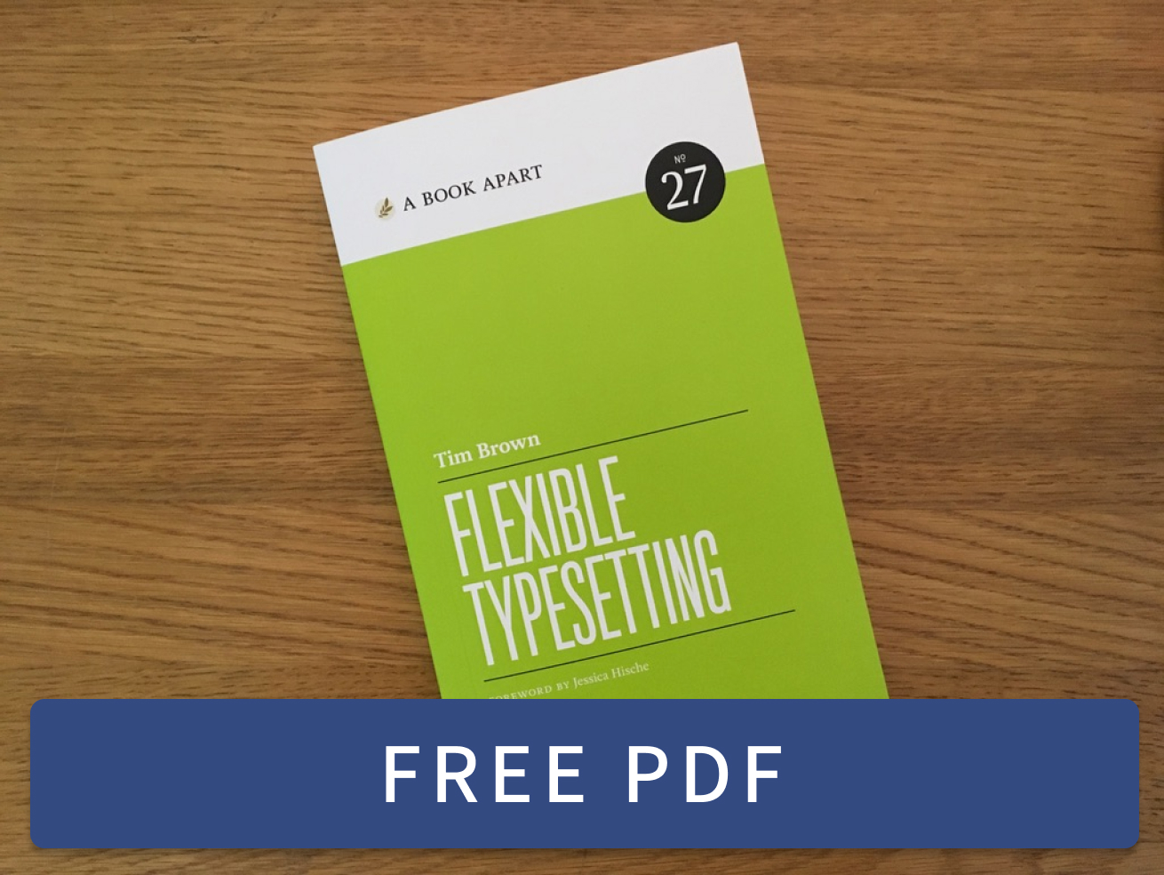 Flexible Typesetting
 Practicing Typography Basics