Breakpoints and range rules

Think about the responsive nature of any particular web experience as a continuum of being. Along this continuum, on one axis, the experience can grow wide or narrow. Along a different axis, it can be near or far. Along a still different axis, it can be coarse or fine. There are many axes.
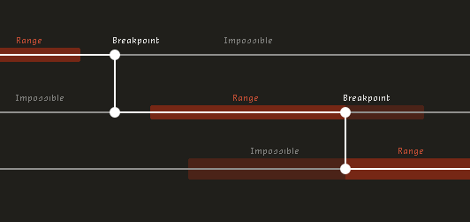
As a designed experience moves along a particular axis, it grows uncomfortable for any number of reasons: paragraphs feel too narrow or wide; font size feels too large or too small; elements touch or become awkwardly distant from one another. To cope with this discomfort, we use breakpoints. Breakpoints are moments of change. They allow us to make design adjustments that are only possible by changing the value or presence of CSS properties. We should invoke breakpoints as they are needed by our designs.
However, some design adjustments just happen in ordinary CSS. Properties like floats, positioning, minimum/maximum widths, and relative units of measurement (percentages, em, rem, unitless line-height) help us negotiate the collective moments between and among breakpoints. Think of these as range rules. Range rules are behavioral limits baked into CSS. For instance, if a column uses a min-width and/or max-width, these are rules that govern its range of motion. When elements in a layout float, but then bump against the limits of adjacent elements, this is a natural part of CSS — there is a range of acceptable behavior.
Range rules are not bounded by breakpoints. A fluid composition could use no breakpoints at all, and still the natural interplay of CSS behaviors could be evident. In a case like this, elements could stack, float, reflow, and resize, with all behavior governed by flexible CSS rules that permit a range of possible existence.
Range rules are also permeable. Breakpoints can trigger changes at any point along any axis of an experience continuum, and have the potential to both purposefully modify and accidentally disrupt the range rules they intersect. For instance, a breakpoint may cause a composition's font size to increase after a certain viewport width is reached, and this may occur before or after a paragraph within that composition has reached its max-width. And if that same paragraph's max-width is em-based, the rule that governs its range now has different absolute limits than it once did (it can grow wider now, because the unit on which it is based has become larger).
Responsive design is about rules, not truths. When we design responsively, maybe it would help to think of elements in a composition as having range rules that coexist and do not necessarily align, rather than treating the continuum of experience between breakpoints as something to be hopped over.
Does this make sense?
I wrote this post in a pretty authoritative tone, but I don't exactly mean it that way. I found it most comfortable to write as if I were, like, explaining the scientific properties of web design. I am still not sure that this makes sense. Please let me know what you think.
Thanks to Ray Schwartz and Chris Silverman for their feedback and general awesomeness. Thanks also to Mark Boulton, Nathan Ford, and Alex Morris, whose tweets today helped motivate me to articulate this all (those guys are incredible, they were already writing about zones/ranges last year!).