Blueprint For Citizenship
Thu, 28 Jul 2016
Following up on the introductory note in my last post about politics, I thought of one way I would like to become more responsible as a citizen. It’s something I’ve had in mind for a while, and something that will take a lot of time, but I’d like to start.
I admire President Obama for a number of reasons, but one early thing that he did really stuck with me in particular. He shared The Blueprint For Change, a written account of various issues and his position on each one.
Here’s my plan
I’d like to make my own blueprint. A "Blueprint For Citizenship". Because when I read the news, I have feelings — but I rarely do anything about those feelings. I never bother to articulate them. I just go back to my own work, my own life. That doesn’t feel like good citizenship.
To sprinkle a bit of typography in here, Jan Tschichold wrote:
Feelings remain rather unproductive unless they can inspire a secure judgment. Feelings have to mature into knowledge about the consequences of [decisions].
Voting, and arguing about politics, based on feelings is immature. I would rather vote using knowledge about the consequences of putting certain individuals in charge to represent me.
So I got started today by visiting this page at WhiteHouse.gov about state and local government. I found two kinds of things on that page that are going to help me with my personal Blueprint.
First, mixed into the text, I found a variety of government institutions and positions mentioned (lieutenant governor, attorney general, secretary of state, auditors, commissioners, senate, assembly, etc.). I’m going to learn more about these, and specifically the ones in my own community.
Secondly, in the footer of the page there’s a list of issues (which can also be found here). I’m going to use this list, as well as President Obama’s original Blueprint, to come up with my own list of issues, so that I can gradually articulate my position on each one.
It’s embarrassing to admit that I have been an irresponsible citizen. I wish that I had paid more attention in school, and in scouts. Community stuff always bored me. I didn’t realize how much my attention mattered. But I want to be better. Owning my shortcomings is a good first step, and if I can encourage others by sharing these ideas about how I’m trying to change — even better.
Politics
Sun, 24 Jul 2016
“I hope to be a more responsible citizen at some point,” is something I wrote when I recently redesigned this site. It’s true, I do, although I’m not exactly sure what that means. Paying closer attention to my community? Participating in political processes like voting? Helping others do the same? I’m not sure how best my abilities can serve us.
Meanwhile, I thought I’d share with you something that I do right now. Years ago I set up a mailing list for my family and close friends. I mostly use it to send them photos of my kids, but occasionally I’ll use it to send excerpts of articles that I feel are important.
I avoid in-person discussions about politics; however, I find reading and sharing text to be a rewarding and thoughtful exercise. So, today I sent three emails to my family. I did this in the same way that I began writing about typography — by sharing excerpts of things I read, not my own writing.
Here are the emails I sent today:
History tells us what will happen next
Trump says he will Make America Great Again, when in fact America is currently great, according to pretty well any statistics. He is using passion, anger, and rhetoric in the same way all his predecessors did — a charismatic narcissist who feeds on the crowd to become ever stronger, creating a cult around himself. You can blame society, politicians, the media, for America getting to the point that it’s ready for Trump, but the bigger historical picture is that history generally plays out the same way each time someone like him becomes the boss.
On a wider stage, zoom out some more, Russia is a dictatorship with a charismatic leader using fear and passion to establish a cult around himself. Turkey is now there too. Hungary, Poland, Slovakia are heading that way, and across Europe more Trumps and Putins are waiting in the wings, in fact funded by Putin, waiting for the popular tide to turn their way.
We should be asking ourselves what our Archduke Ferdinand moment will be. How will an apparently small event trigger another period of massive destruction. We see Brexit, Trump, Putin in isolation. The world does not work that way — all things are connected and affecting each other. (Medium)
America Has Never Been So Ripe for Tyranny
For the white working class, having had their morals roundly mocked, their religion deemed primitive, and their economic prospects decimated, now find their very gender and race, indeed the very way they talk about reality, described as a kind of problem for the nation to overcome.
And so they wait, and they steam, and they lash out. This was part of the emotional force of the tea party: not just the advancement of racial minorities, gays, and women but the simultaneous demonization of the white working-class world, its culture and way of life. Obama never intended this, but he became a symbol to many of this cultural marginalization.
...
Mass movements, Hoffer argues, are distinguished by a “facility for make-believe … credulity, a readiness to attempt the impossible.” What, one wonders, could be more impossible than suddenly vetting every single visitor to the U.S. for traces of Islamic belief? What could be more make-believe than a big, beautiful wall stretching across the entire Mexican border, paid for by the Mexican government? What could be more credulous than arguing that we could pay off our national debt through a global trade war? In a conventional political party, and in a rational political discourse, such ideas would be laughed out of contention, their self-evident impossibility disqualifying them from serious consideration. In the emotional fervor of a democratic mass movement, however, these impossibilities become icons of hope, symbols of a new way of conducting politics. Their very impossibility is their appeal.
But the most powerful engine for such a movement — the thing that gets it off the ground, shapes and solidifies and entrenches it — is always the evocation of hatred.
…
What makes Trump uniquely dangerous in the history of American politics is his response to enemies. It’s the threat of blunt coercion and dominance.
Trump tells the crowd he’d like to punch a protester in the face or have him carried out on a stretcher. No modern politician who has come this close to the presidency has championed violence in this way.
Supporters have attacked hecklers with sometimes stunning ferocity. Every time Trump legitimizes potential violence by his supporters by saying it comes from a love of country, he sows the seeds for serious civil unrest.
...
Trump is not just a wacky politician of the far right, or a riveting television spectacle, or a Twitter phenom and bizarre working-class hero. He is not just another candidate to be parsed and analyzed by TV pundits in the same breath as all the others. In terms of our liberal democracy and constitutional order, Trump is an extinction-level event. (New York Magazine)
Responding to cruelty with kindness
Normally I would have blocked him, or sent him something cutting & then blocked him. But for some reason—maybe because I heard this week's This American Life, which discusses responding to cruelty with kindness...or maybe because he wasn't all-CAPS-ing epithets at me—I didn't block him. I wrote this... (link now broken, unfortunately)
Quarterly report
Mon, 11 Jul 2016
Time for a quarterly report. I’ll list some things I did in the past few months, and retire accomplishments less recent.
Done last quarter
- Shared ideas about new typographic tools with Adobe design leadership. Imagine the previous bullet about algorithms and machine learning, plus my thoughts over at Universal Typography.
June 2016
- Talked separately with the Typekit team, Adobe researchers, and Jon Gold (who recently penned a couple of great blog posts), about algorithmic typography and machine learning.
June 2016
- Started this blog. Hello world.
May 2016
- Called in to Shop Talk Show. Chris and Dave were kind enough to share my thoughts on modular scales and vertical rhythm.
May 2016
- Worked on design patterns for Typekit integrations. More about that later this year.
April 2016
From a while ago
Retiring this stuff from Recently:
- Talked with Chris Coyier and Dave Rupert on Shop Talk Show #172. This was amazing! I’m a huge fan of the show.
Jun 2015
-
Spoke at An Event Apart San Diego. Thanks, as always, to Toby, Marci, Stephen, Mike, Sean, Eric, and Jeffrey. Nothing like AEA.
Jun 2015
- Wrote Good looking typography for Dear Design Student.
May 2015
- Wrote Paying for type for Dear Design Student.
Apr 2015
-
Gave the closing talk at Industry. Gavin Elliot puts on a stellar event, and Newcastle Upon Tyne is a beautiful place.
Apr 2015
-
Spoke at An Event Apart Seattle. Amazing event, beautiful city, very cool hotel, and the best speakers dinner ever.
Mar 2015
-
Spoke at An Event Apart Atlanta. Demonstrated a new kind of typesetting tool that uses font metrics to offer recommended font-sizes, line lengths, and line heights, and simulates the result in multiple contexts at once.
Feb 2015
- Wrote about Typekit’s ethos.
Feb 2015
Remember this moment
Wed, 22 Jun 2016
Every day, I wake up and can’t wait to start work. It’s been that way for at least ten years. This is such an exciting moment. For sharing ideas, making tools, and actually practicing typography. We are designing in the fourth dimension, and we are disoriented.
Later, when we look back, I want to remember that I tried hard to understand this moment's historical significance, and its potential to influence the future, as I decided how to spend my time. I want to remember that I was careful. That I paid attention. That I enjoyed trying to orient myself.
And I want to remember that it was incredibly frustrating. My brain and hands want to design with tools that don’t exist yet. Only time and effort will make those tools real, and waiting – having to spend my life convincing others about the significance of this moment, and having to refocus my energy repeatedly as we crawl toward answers – is agonizing.
Making time to read
Fri, 27 May 2016
My work at Typekit has been intense lately because we’re making big changes, and that means lots more communication to coordinate everybody (plus, you know, doing the work we communicate about). I have more active side projects than ever, and they're going well. My schedule works for me. I have plenty of time with family and friends.
But I don’t read or study the work of others as much as I used to. I don't pay attention to other people the way I used to, and I don't like this at all. Reading blog posts and articles is how I got where I am, professionally. It's why I have the ideas I have, and it's the basis of my relationships with good people (“Hey, I liked what you wrote...”). Playing with a technique or an idea somebody shared has always helped me think.
Reading time can be hard to justify, even to oneself. There is no deadline. It's not going to move any immediate projects forward (most likely). And it often feels like a waste of time, especially if your interests are diverse. But it's important. Most great work is the product of collaborative thinking.
Jeffrey said that if you don't write, you don't know what you think. Well, if you don't read, you don't know what you could think.
Pressure calendar
Mon, 9 May 2016
Sometimes I make a pressure calendar — a quick, disposable calendar that helps me think clearly when I feel overwhelmed. Here’s one I made the other day.
I use pressure calendars when my to-do list is full of tasks that seem equally important, or tasks that could each consume all of my available time (like when I have speaking engagements or deadlines approaching). A pressure calendar shows me how much time I have, and helps me spend that time wisely.
It’s a printout from my calendar app, so for starters I can see scheduled commitments. If I have family visiting for a few days, for example, I know I won’t be working in the morning on those days. If I have travel plans, I know I’ll spend the night before packing. And so on.
I draw horizontal lines on the printout to divide days into thirds. Into the available chunks, I pencil in tasks. This helps me judge available time realistically, because I know I can expect four hours of productive time in each third of a calendar day. What can I get done in four hours?
In practice, things never go exactly according to my penciled-in plan. Stuff happens, so I cross off the days that have passed, erase as needed, and sketch out new plans. Although this kind of editing can get messy, it helps to be able to wrap my head around my tasks in a time-related way without having to use software. Hassles and overhead that wouldn’t normally bother me can really stress me out when I’m under pressure.
I refer to the pressure calendar constantly until I no longer feel overwhelmed — and then it’s amazing. Amazing to see how much I accomplished in a short span of time. Amazing to reflect on the stress I felt. And amazing to take all that stress, crumple it up, and toss it in the trash.
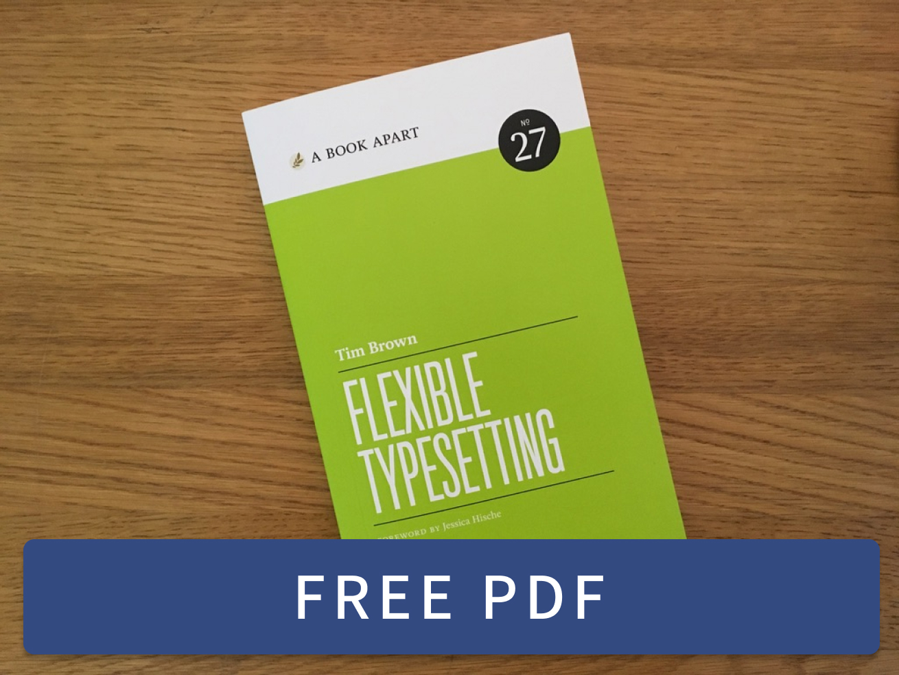 Flexible Typesetting
 Practicing Typography Basics