For many years I’ve been a happy You Need A Budget customer, and as we head into 2024 it continues to be an important part of my financial strategy. Saving up for emergencies and big expenses, hedging fluctuating categories, checking digital envelopes before making a purchase, and tracking all bank transactions in one place are habits that give me peace of mind and help reduce stress in stressful times.
YNAB is a rare and valuable service that makes responsibility easier and helps me take good care of my family. Sign up with this referral link and we each get a free month.
Sat, 30 Dec 2023
🎄 December 29th. Rainy and warm. Very grateful for holiday vacation time. As Eileen and I drove to pick up the kids from a sleepover we discussed definitions of done for our quarterly goals, then I time-blocked the calendar when I got back to my iPad. Listened to Rick Rubin on Huberman. Revisited Rick’s book The Creative Act and highlighted many sections.
Read a stack of books with my 6yo, including some Elephant and Piggie and a few pages of her new Highlights puzzle book. Finished reading the first Warrior Cats novel because my 11yo insisted. It was a fun read, and fun to discuss with her, though I still have trouble remembering the many characters’ names (which change repeatedly).
Played Ravine with my older girls, a cooperative board game they got for Christmas that involves foraging and crafting for survival after a plane crash. Our party died several times from storms, animals, and poisoned mushrooms, but then we lucked out by finding permanent shelter in a cave.
To finish the day we had a candlelit dinner of pasta/quinoa with family-recipe homemade sauce and opened bottles of Montepulciano and sparkling cider.
Sat, 30 Dec 2023
Rick Rubin, interviewing Arnold Schwarzenegger:
RR: When you list the great directors that you worked with, if you think of each of them, would you say there are any qualities that they all shared? What made those people so great, from your perspective?
AS: All of them had vision. When they tell you the movie that they want to do, they will look out into emptiness and tell you of what the movie will be about. And what’s important in this movie, and how you should play the role in this movie, and what they’re trying to get across. So they were visionaries ... all of them had a vision. They had the guts to do it. They didn’t think small, they thought big. And they didn’t listen to the naysayers.
Listened to this yesterday, and it was just what I needed to hear. What an inspiring interview! An early Christmas present from two legends. I appreciate Rick’s deep curiosity and Arnold’s forthright guidance.
Sat, 23 Dec 2023
Feedback is a gift
Wed, 20 Dec 2023
I’m fortunate to work with an excellent manager. She gives me freedom, encourages me, and helps me grow. With her guidance, I spent 2023 regularly interviewing customers and managing the prototyping of two concepts that became high priorities for our team (one of them our top priority). It was a wonderful learning experience, feeling out new processes and facing the pressure of strong interest in nascent plans.
But while I was learning and growing, my team was struggling to understand me (and my projects). I know this because my manager gathered feedback from my colleagues, collating and sharing it with me as part of a new coaching process. The feedback touched on my strengths, but I focused on the “areas to improve”.
To be frank, when I first got this feedback I felt many negative emotions. I felt angry, embarrassed, and discouraged. I felt my colleagues judged me unfairly, and I criticized myself as I thought back over the months. I couldn’t settle these negative emotions, so late that evening I dumped all the feedback into a text file and spilled out my reactions line-by-line. Theraputic!
Next morning, after taking a fresh look, I distilled the feedback into five priorities — and realized that my super-smart, hard-working colleagues had given me a playbook for how to be a better teammate and how to improve all of our working lives. These priorities aligned perfectly with the quarterly goals I had just set for myself, so I included them as “coaching improvements” in each relevant goal’s definition of done. Because I have confidence in knocking out quarterly goals, I know I can address this feedback too and make positive changes.
Coincidentally, I recently listened to the Huberman Lab podcast episode with Dr. Adam Grant, in which Grant describes the concept of a “second score”. He tells a story about giving a workshop to high-ranking military officials and receiving tough feedback (they felt he had wasted their time), effectively a low score. Grant felt bad, just like I did. And rather than settle for this, he responded by trying to get a high score on how well he responded to the first score. The second score reflects how well we take feedback.
I’m grateful for my colleagues’ advice, grateful for my caring manager, and grateful for my ability to respond with understanding and agency. And I’m shooting for a high second score.
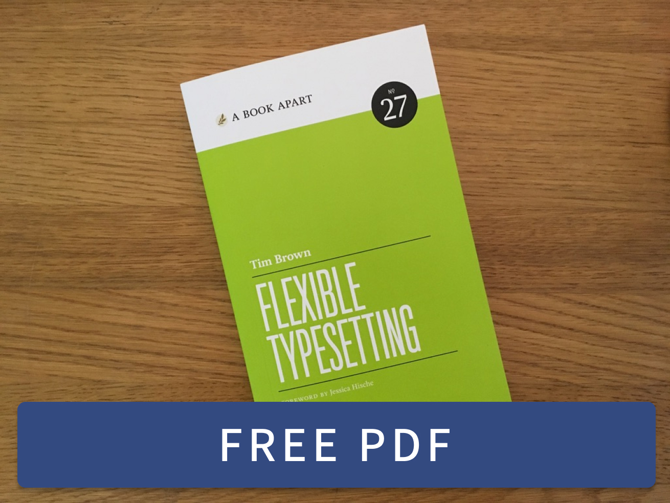 Flexible Typesetting
 Practicing Typography Basics