CSS forces
Flexibility causes pressure that makes layouts look bad. We can relieve that pressure in isolated ways thanks to CSS calculations, interpolation, and container awareness, but we lack a means of interconnection that would help maintain balance in compositions.
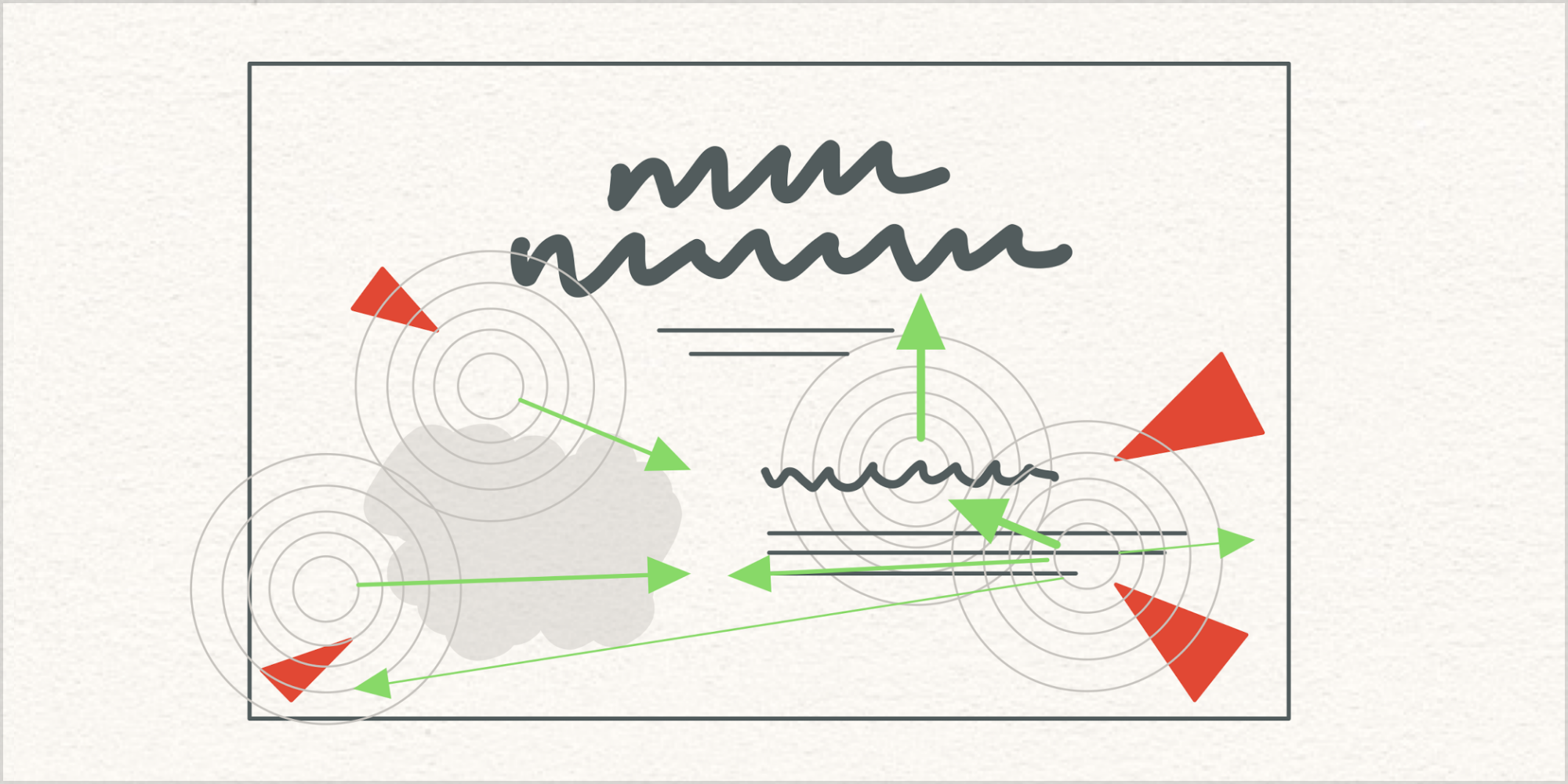
CSS forces are values that travel from a high-pressure area to other, low-pressure areas to help layouts reach a comfortable equilibrium.
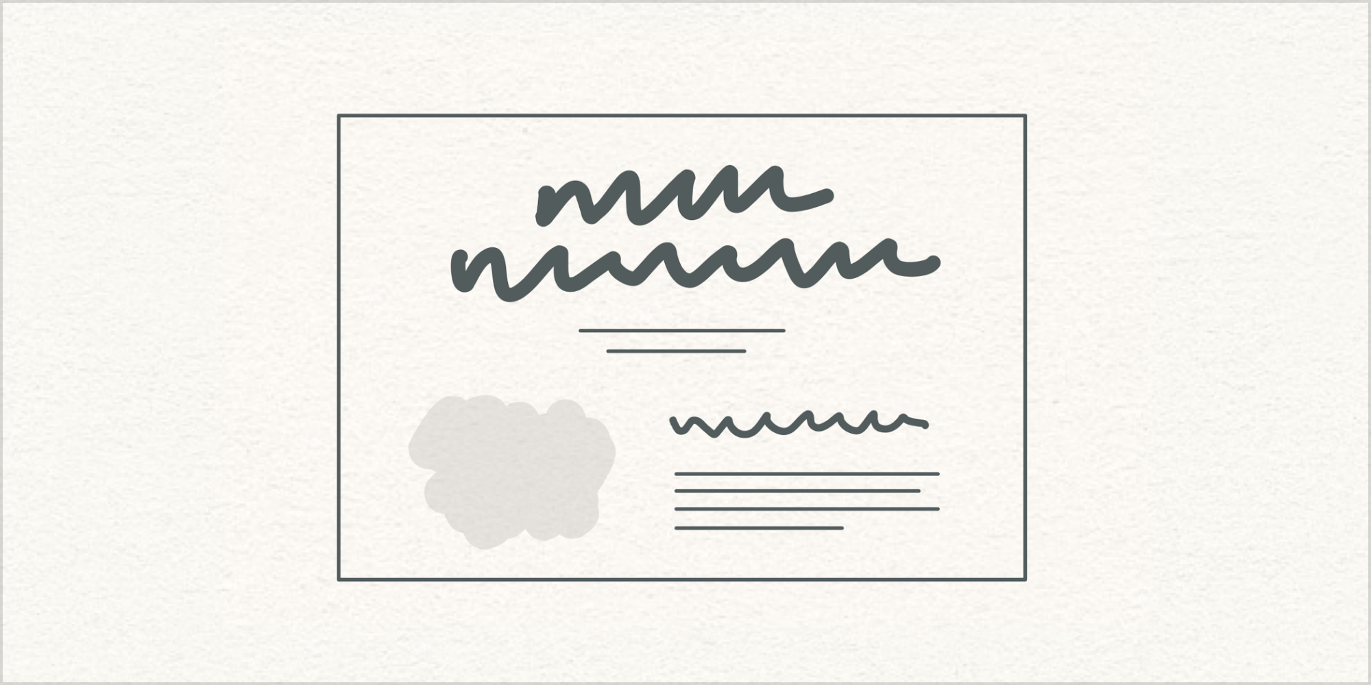
Let’s assume that this layout looks good.
Good-looking designs are hard to make. People have practiced design for centuries, and by practicing we develop our judgment about what looks good. Design may not always succeed, or feel appropriate, and we may not always agree about how good something looks, but practitioners share a general sense of overall quality or goodness.
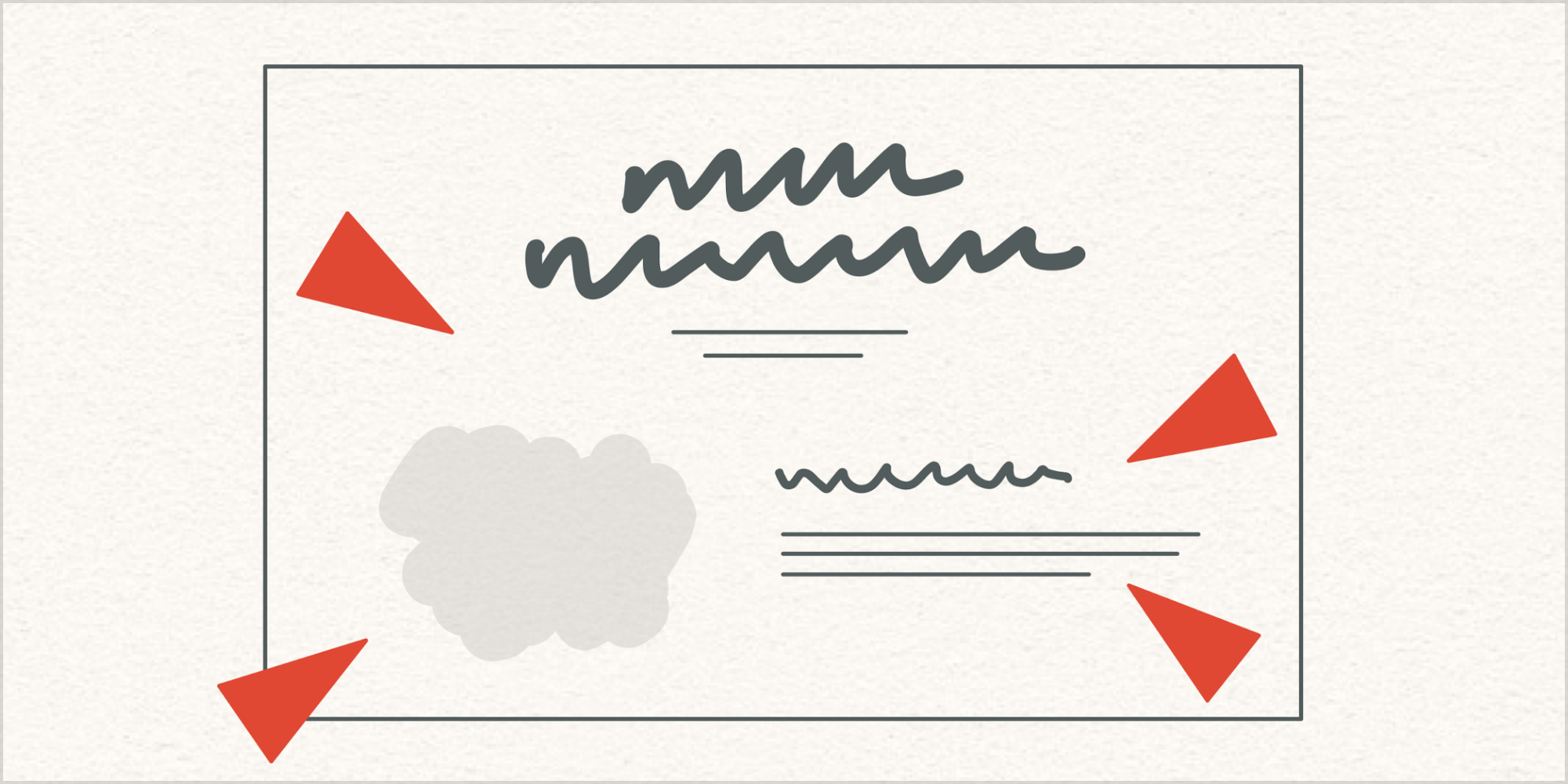
Next, let’s assume that this layout has changed in a way that does not look good. Maybe it feels like there’s too much empty space. Maybe short paragraphs are looking weird. Maybe heading sizes seem like they need adjustment. Whatever is going on, certain pressures are causing disruption.
Layouts change for many reasons. As designers of flexible compositions, we need to understand that there is inherent balance in good-looking typography, and that this balance is disrupted by pressure that results from layout changes.
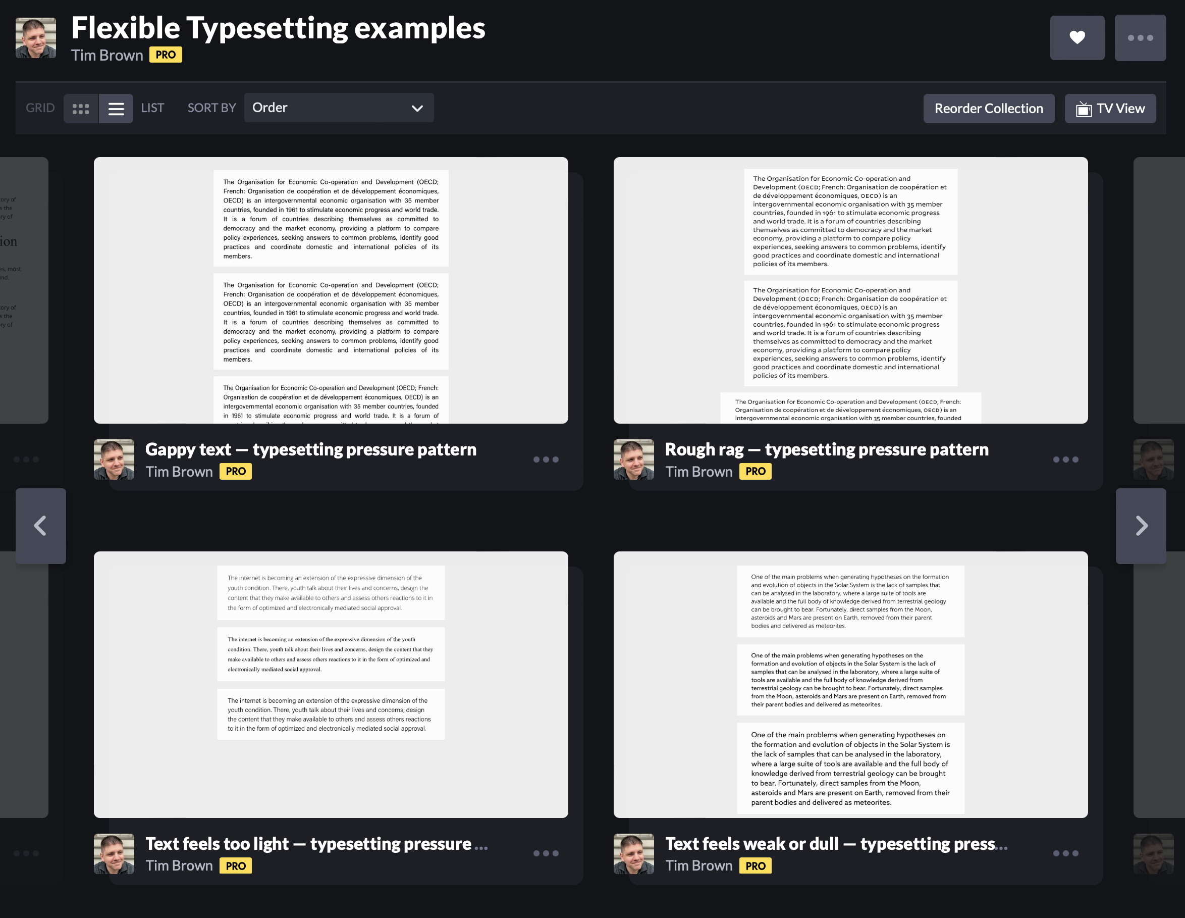
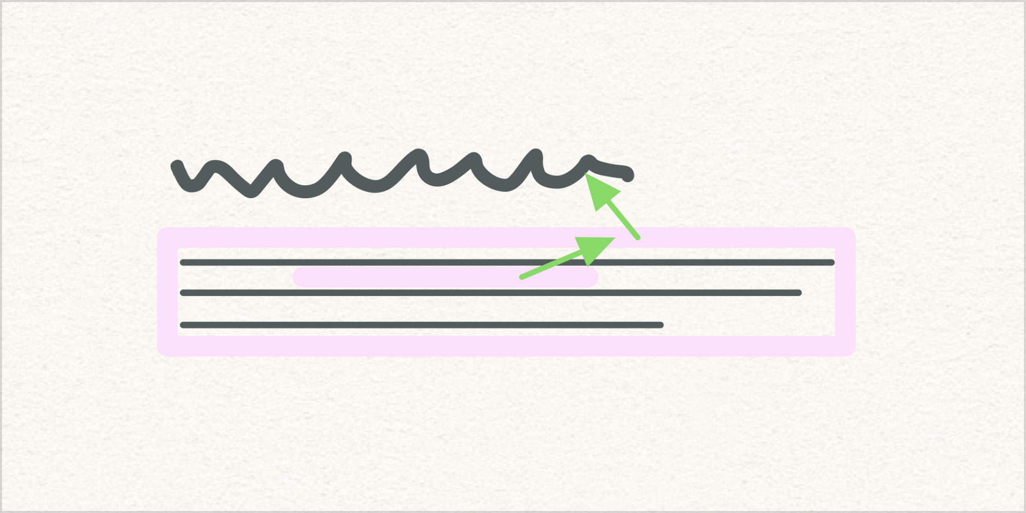
Pressure is easiest to grasp when we look at text blocks in isolation, as we did in Chapter 6 of Flexible Typesetting:
Relieving pressure gets easier with practice, because we develop schema about available options and we have experiences that inform our judgment about which options to apply in which circumstances. But relieving pressure in isolated text blocks isn’t enough to bring flexible layouts back into balance.
To achieve an active balance throughout a composition, we should borrow a concept from fluid dynamics: pressure-gradient forces.
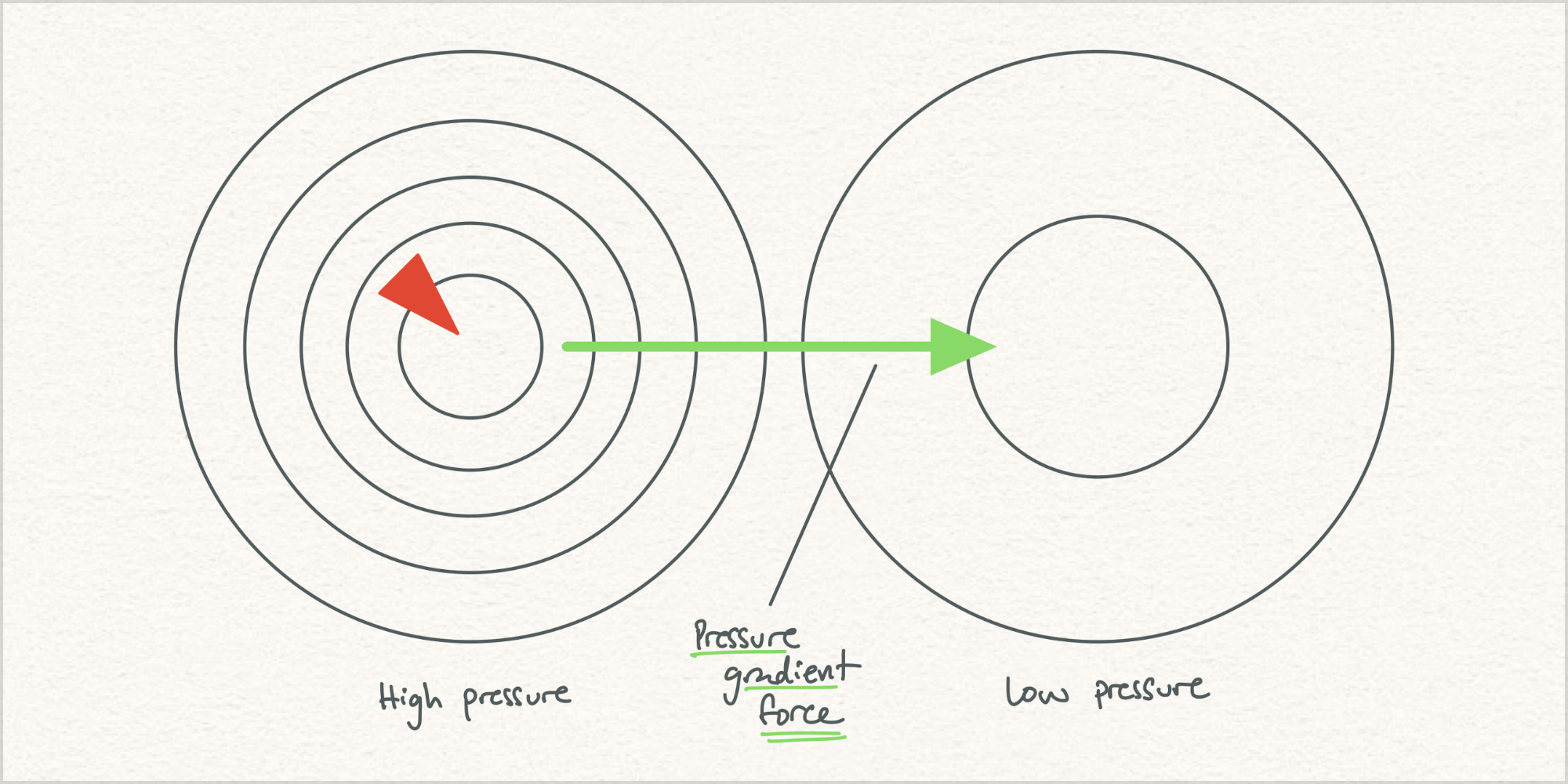
Wikipedia:
The pressure-gradient force is the force that results when there is a difference in pressure across a surface [and it] is always directed from the region of higher-pressure to the region of lower-pressure. When a fluid is in an equilibrium state (i.e. there are no net forces, and no acceleration), the system is referred to as being in hydrostatic equilibrium.
Sounds like a recipe for balanced, fluid layouts! (Never mind that in meteorology high-pressure areas feel more comfortable and low-pressure areas mean rain. My point here is that pressure gets distributed to balance a system.)
Observing and relieving pressure shouldn’t be an isolated exercise. Pressure creates opportunities for forces to distribute relief throughout a layout. Practically speaking, this means we need the ability to recognize pressures, apply forces, and prioritize forces.
For example, a flexible line spacing value in one container could influence margins that surround the text block. That change in spaciousness may mean that nearby headings need size or spacing adjustments to stay feeling connected.
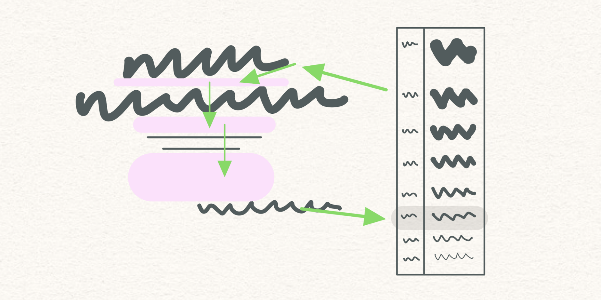
Or a scaling heading’s font size could influence a root variable that controls a measurement system, thereby affecting other parts of the composition in ways that should trickle into remote property relationships.
Always with you, it cannot be done. — Master Yoda
I don’t know how to make this idea real, but I sense the need for it to exist. Experiments with CSS variables in Vue, as well as my limited understanding of CSS module scripts, make me want to believe it is possible. I have wished for things before, and it has worked out well.
For flexible design to look as good as humans are capable of making things look, our container-oriented constraint systems need a key counterpart — a content-sensitive relationship system that balances flexible layout by prioritizing and directing forces according to pressure.